Architecting Complexity and Prioritizing People
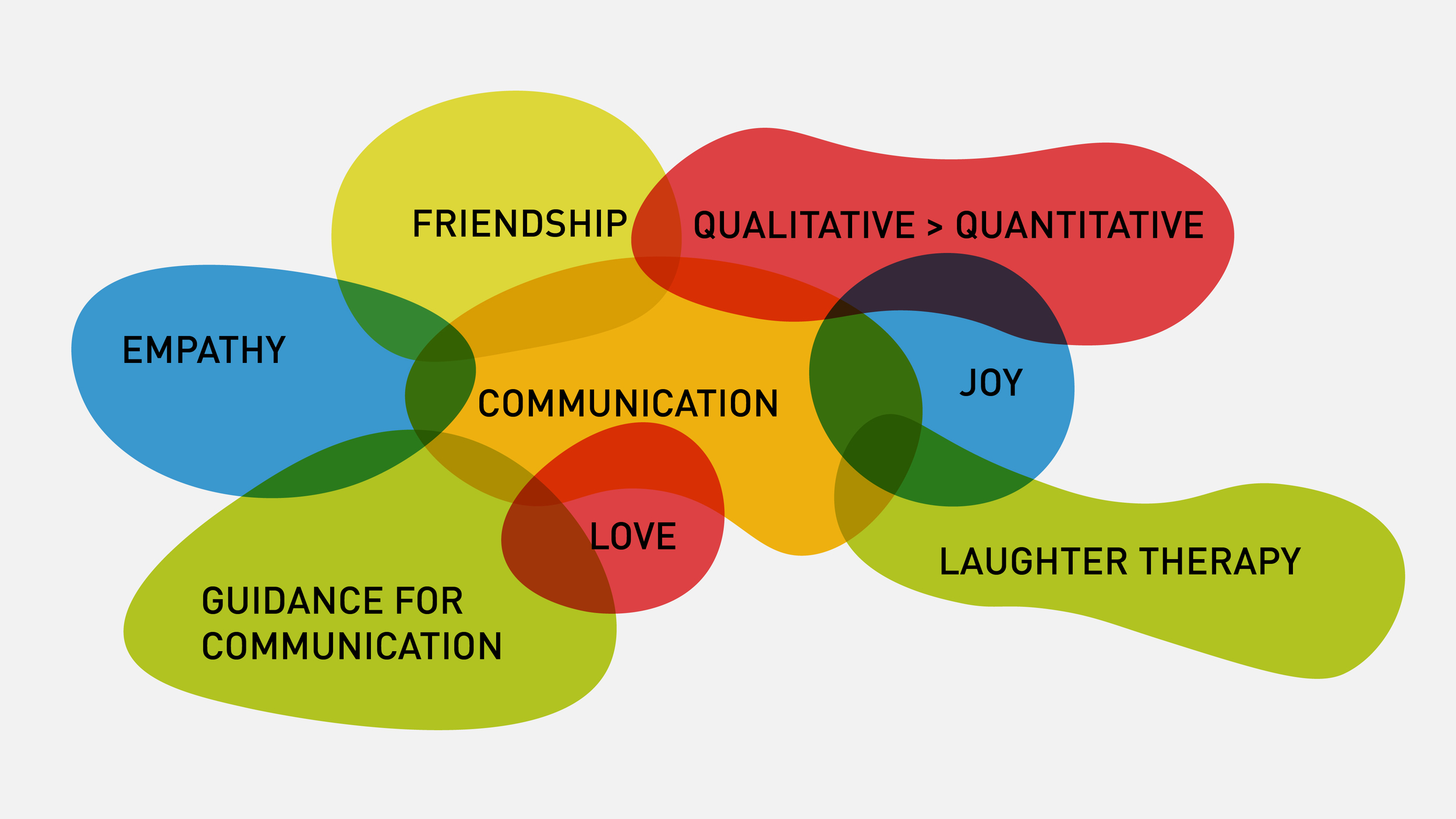
For today’s thesis workshop we were asked to create a visual aid in order to simplify a complex territory in our theses. Using Abby Covert’s “How to Make Sense of Any Mess” book as a guide, the first thing I followed was “draw the mess” exercise. Abby, in her book, suggests to draw the mess in order to understand it. Here in this drawing (Figure A), I realized that I am trying to make some points about love, communication, empathy, joy and many other things which overall is productizing complementary medicine.

Then, for the visual aid I drew this mess on a big medium (Figure B) and then I drew another mapping diagram to show my main purpose with this mess. Which is basically to say “ideal health is in the transaction of complementary and conventional medicine”. In class workshop, we paired up with classmates in a speed dating format to show our information architecture trials to each other. Showing the mess out of your head and on the paper to someone else helps you a lot in realizing how difficult it is to understand an unfamiliar topic, because seeing his reaction makes you empathize with him and look at your graphics from his perspective. Some points that I found out are colors are incredibly important and dangerous. One should be aware of how much it could be confusing to use different colors on a mapping diagram. If there is no color coding or rational reasons, then the audience get confuse, because they try to associate the elements with similar colors.

Another thing that I realized is that the language should be crafted in a way that your audience could easily digest the information on your materials. In this case my audience was not oncologists, cancer survivors or medical designers, but it was my classmates, the majority of who are unfamiliar with the lexicon (jargon) of the topic.
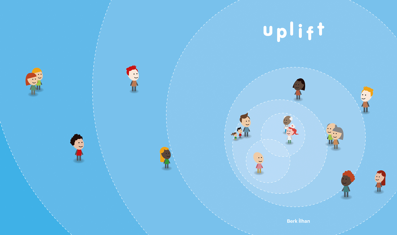
Other than this exercise there was another workshop which helped me to see the priorities of different people in my thesis. We each wrote down the direct users of our thesis products/services, the people who might be helpful for our careers, the industry people whom our work touches to and the people whom we want to make proud. Although I have been unconsciously thinking about all these people in somewhere deep in my brain, it was amazingly helpful to name them and see how I prioritize them on an axis, visually (Figure D). Throughout this workshop we were in teams and we helped each other to solve some prioritization or naming issues. It is obvious that getting a couple of fresh eyes into your complexity helps a lot.
