Thanks to Blurb, you can get a copy of this book, which is a compact diary of my journey!
http://www.blurb.com/b/6733897-uplift
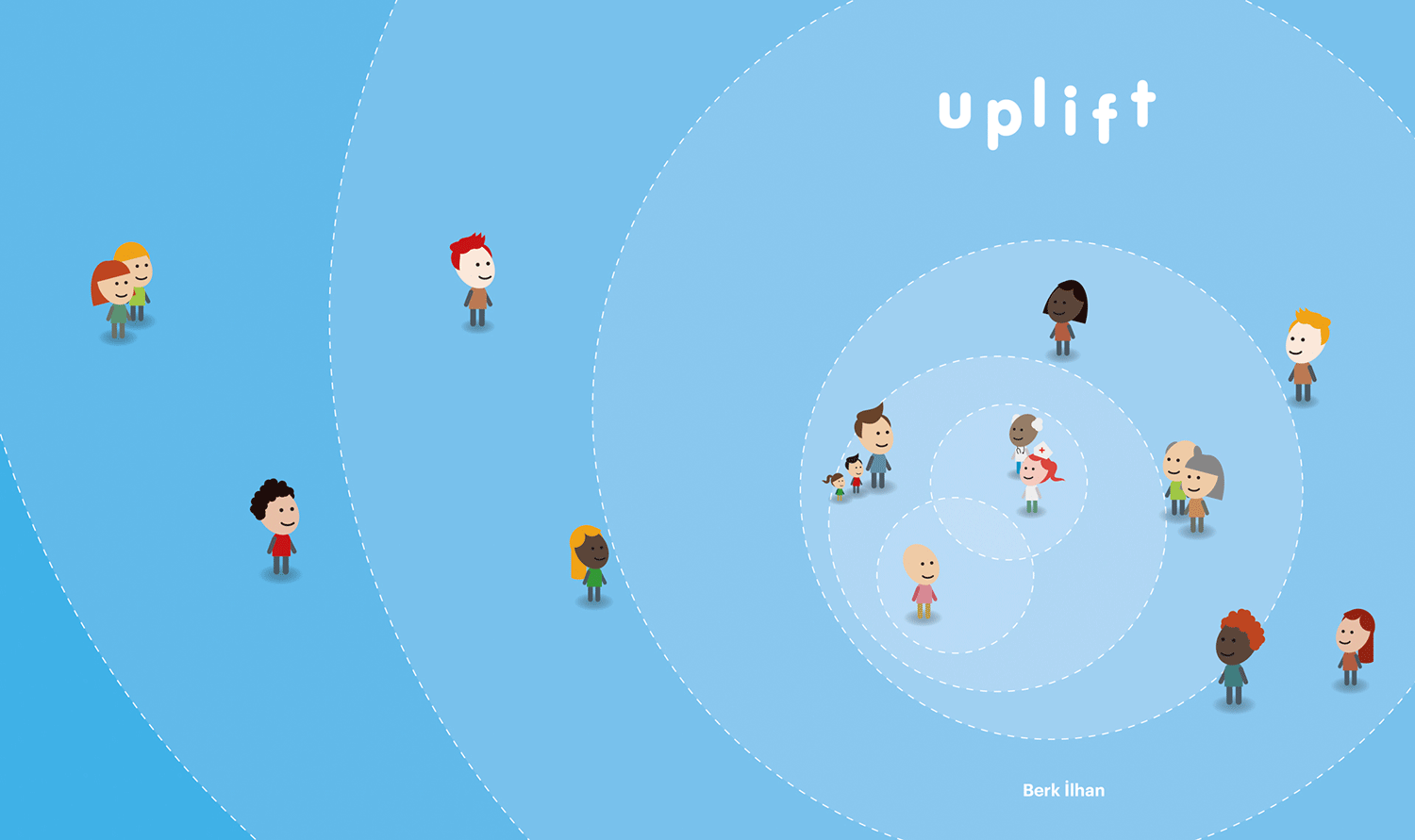
The personal blog of my MFA thesis journey, consists of diagrams, system maps, frameworks of Information Architecture, and early prototypes.
Thanks to Blurb, you can get a copy of this book, which is a compact diary of my journey!
http://www.blurb.com/b/6733897-uplift
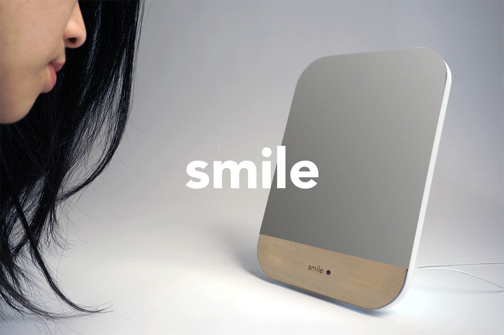
Smile Mirror is an emotionally smart mirror that becomes reflective when it detects a smiling face. The purpose of Smile Mirror is to create a delightful personal moment, by surprising people with the reflection of their powerful smiles.
Smile Mirror is one of the many award winning delightful inventions of Berk Ilhan. Inspired by the life and work of the real Patch Adams -the doctor behind Robin Williams' Patch Adams movie- Berk focused on creating experiences and products for cultivating joy. Learning from the numerous studies and research about Positive Psychology, and specifically that smiling elevates your mood and reduces stress, Berk created the playful and interactive mirror that encourages people to connect and engage with their reflections, as they are smiling.
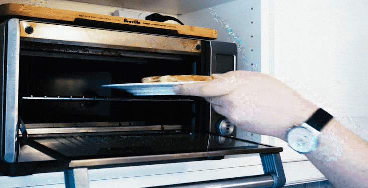
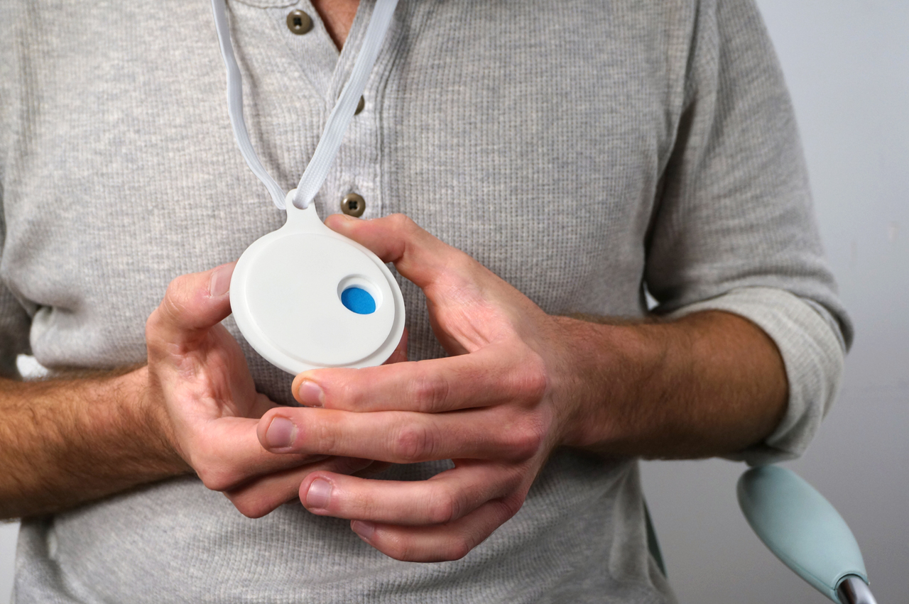
Smart smile is a smart switch that could be attached to electrical appliances. Communicating with the smart wall plug, Smile Switch could turn any kind of appliances to smile-triggered systems. For instance, you can make a cappuccino by smiling. It provokes users to smile more often.
According to the facial feedback hypothesis facial expression could change how we feel. Smiling is a powerful tool to reduce the stress caused by an upsetting situation. It's a mindset and a choice that one makes to decide how to approach to a circumstance. Could objects be a reminder of this gesture? It's an explorational project.


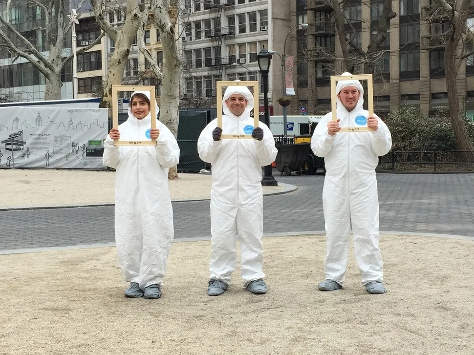
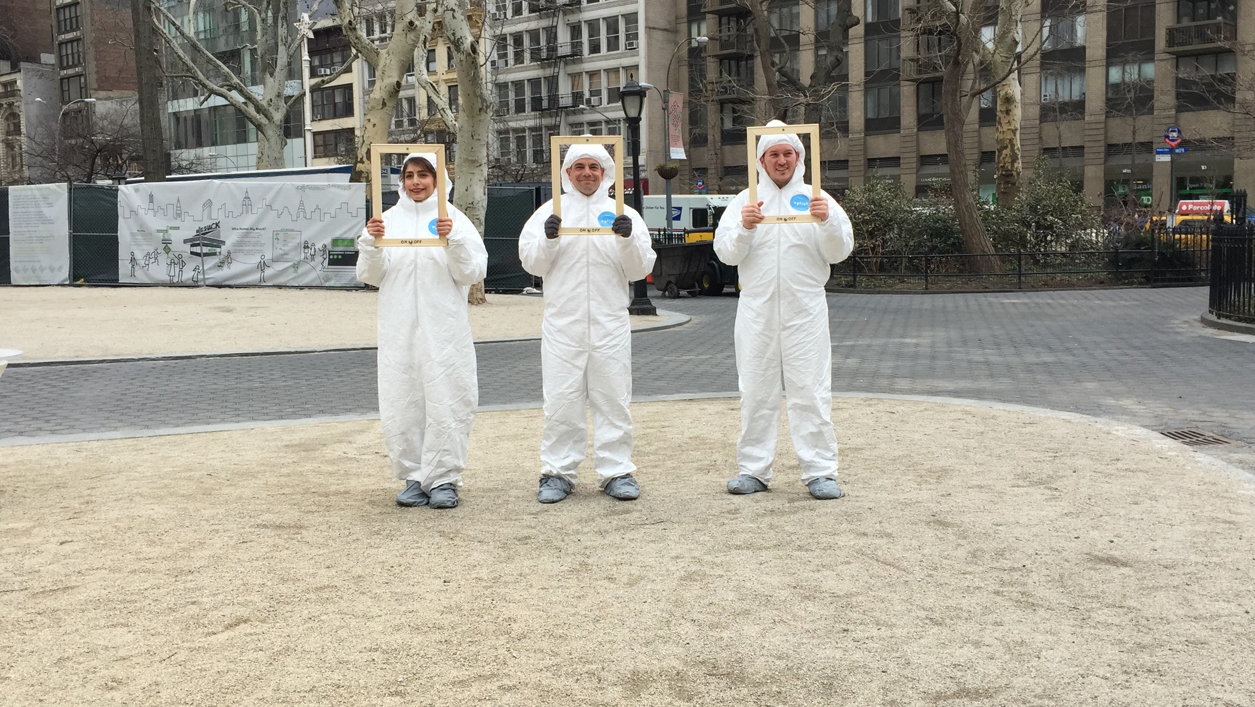
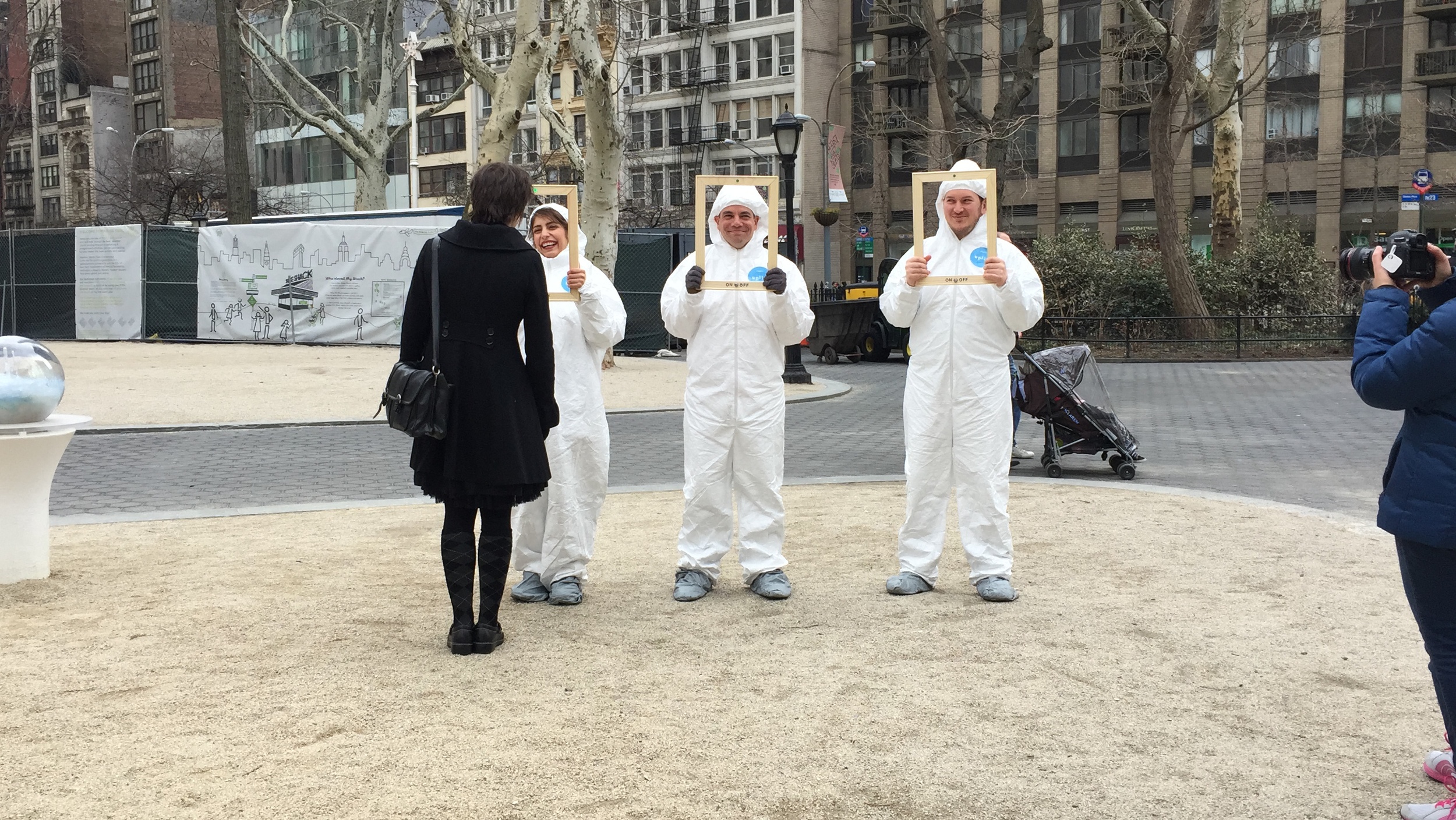
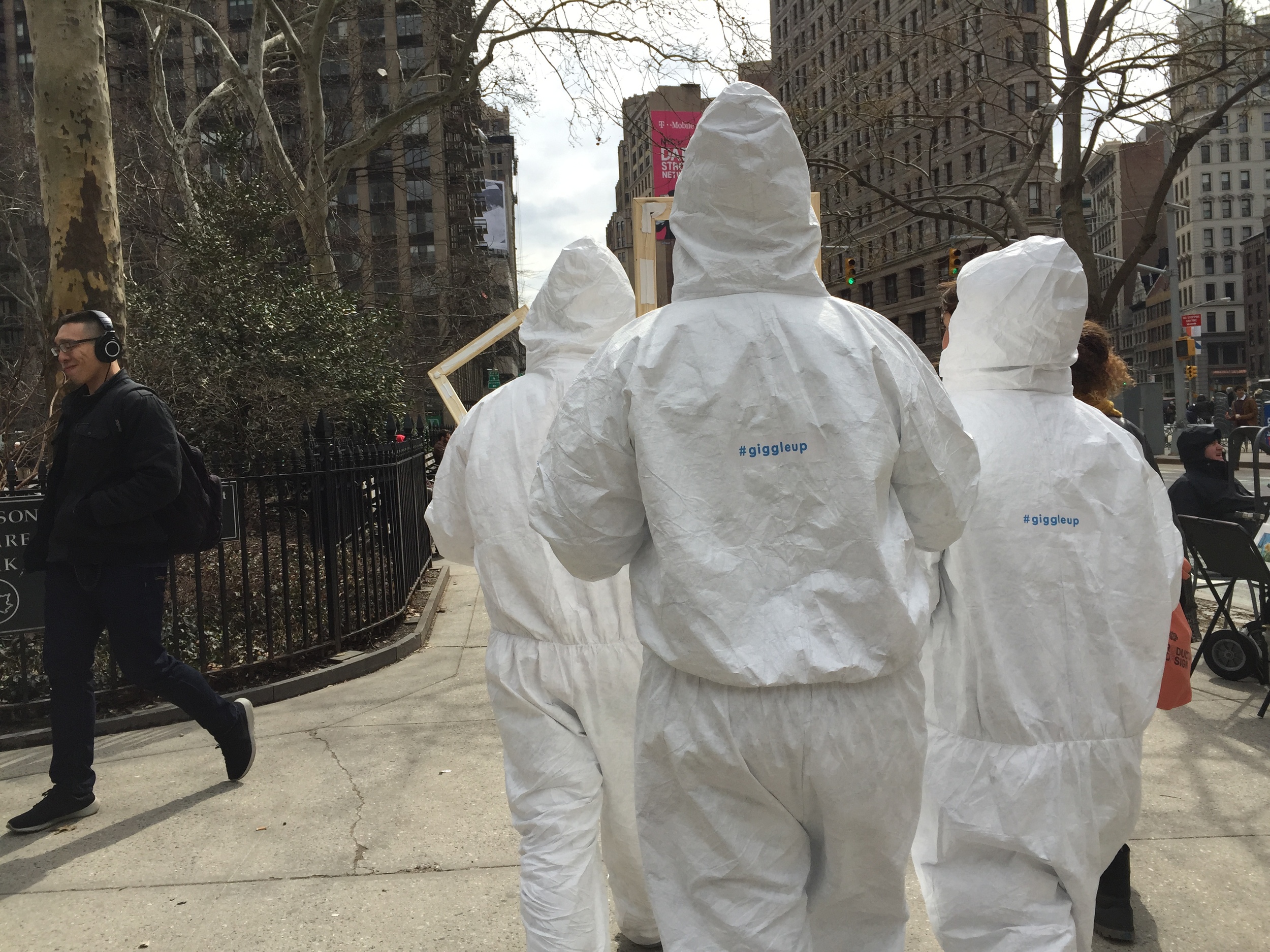
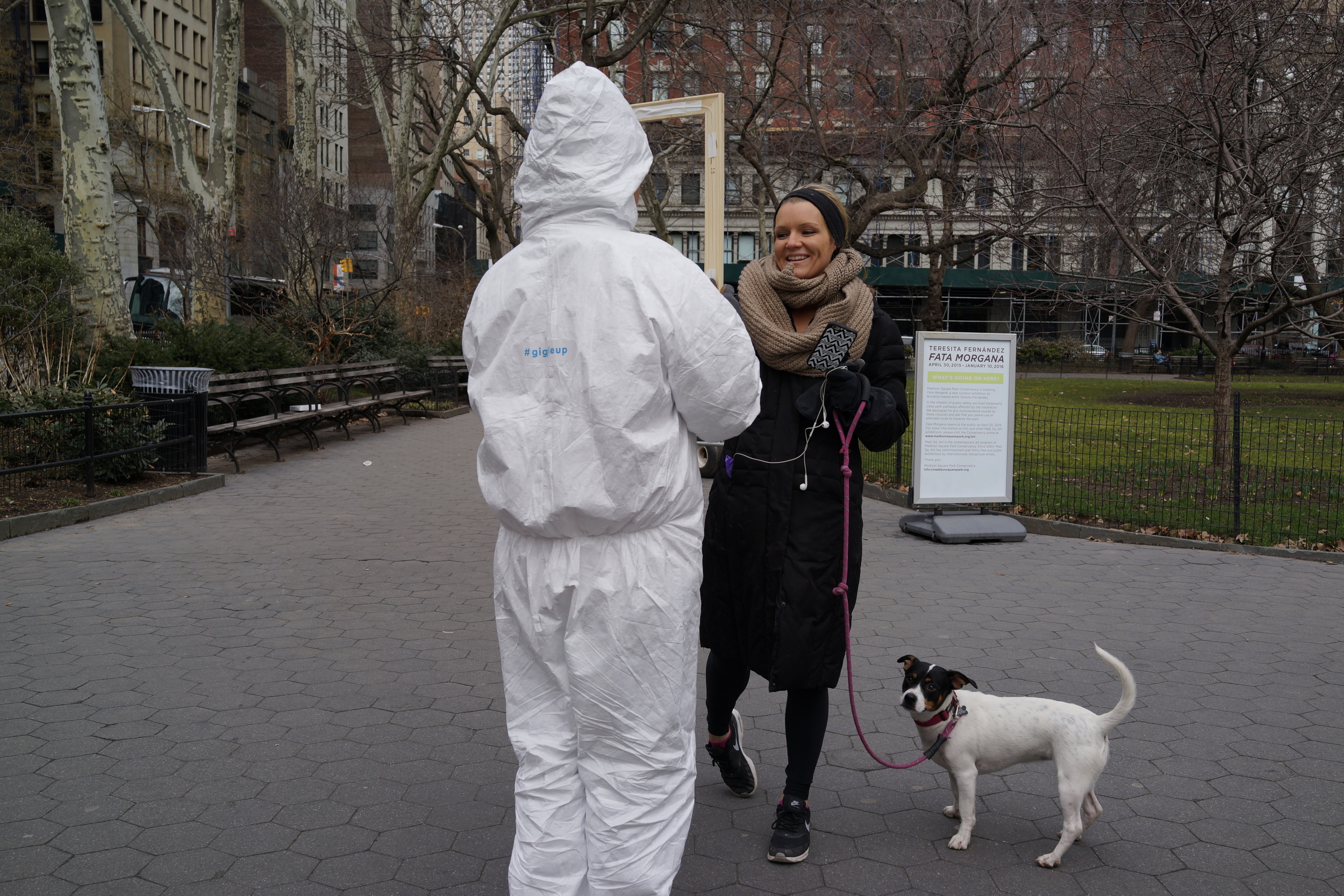
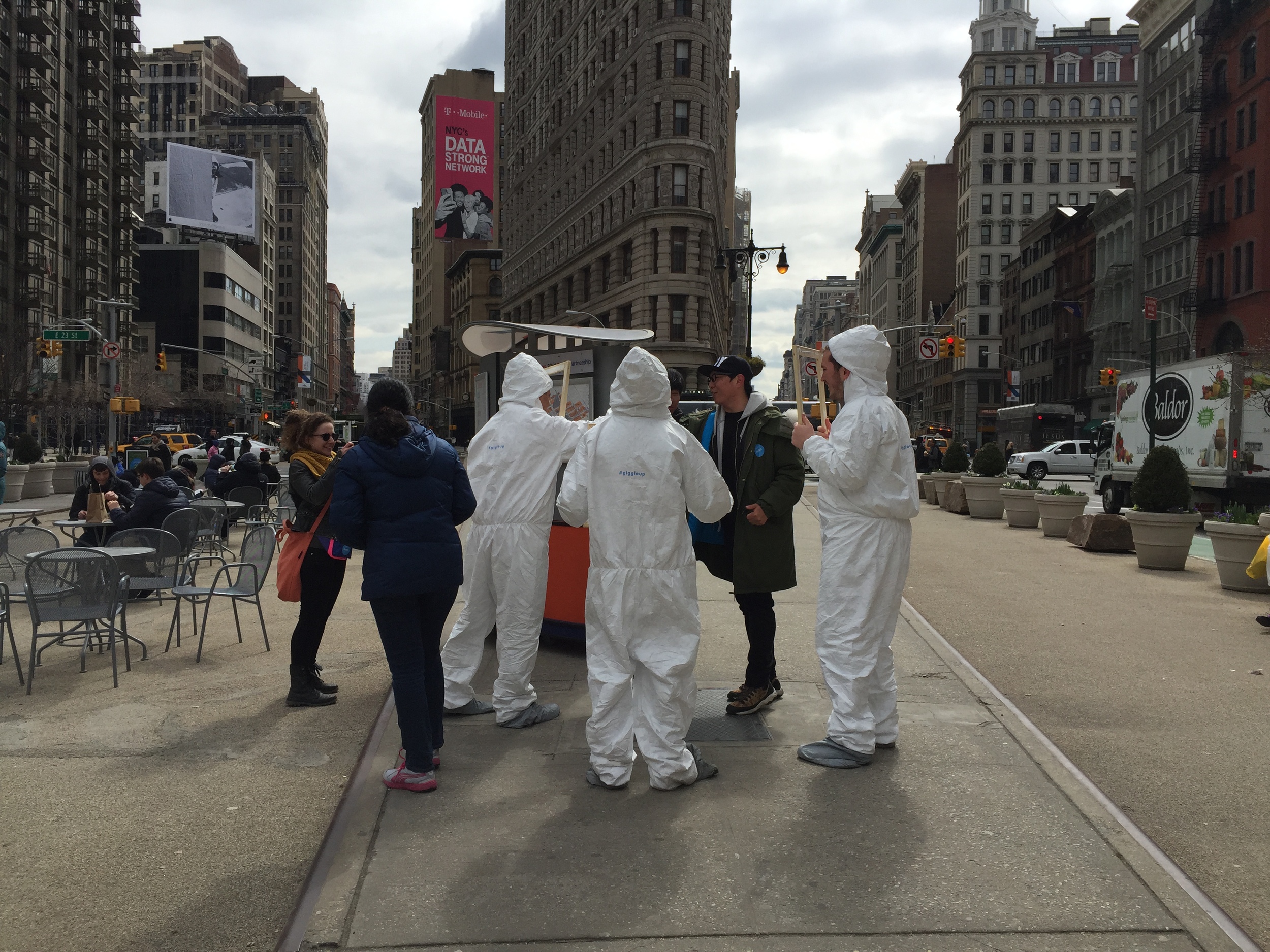
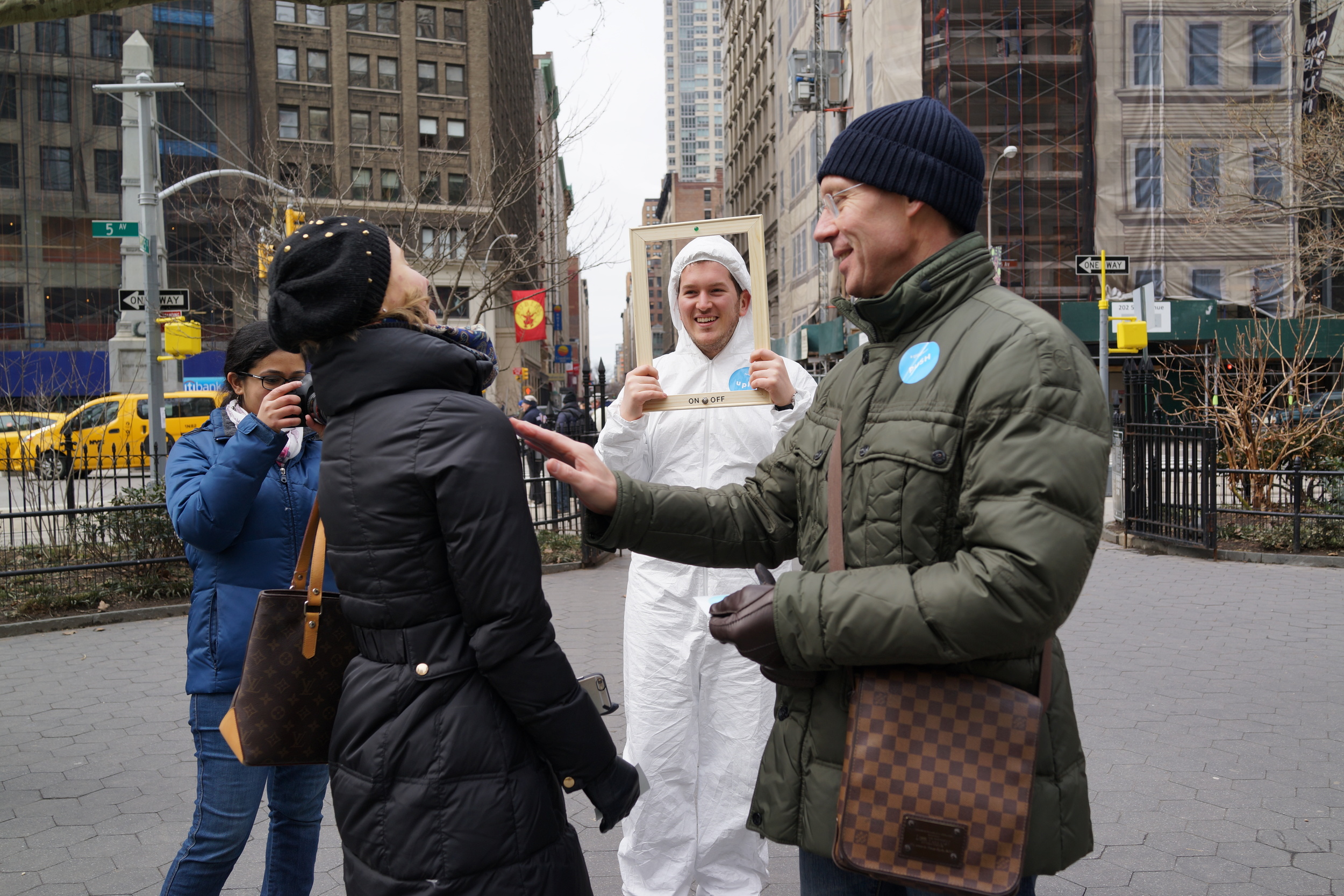
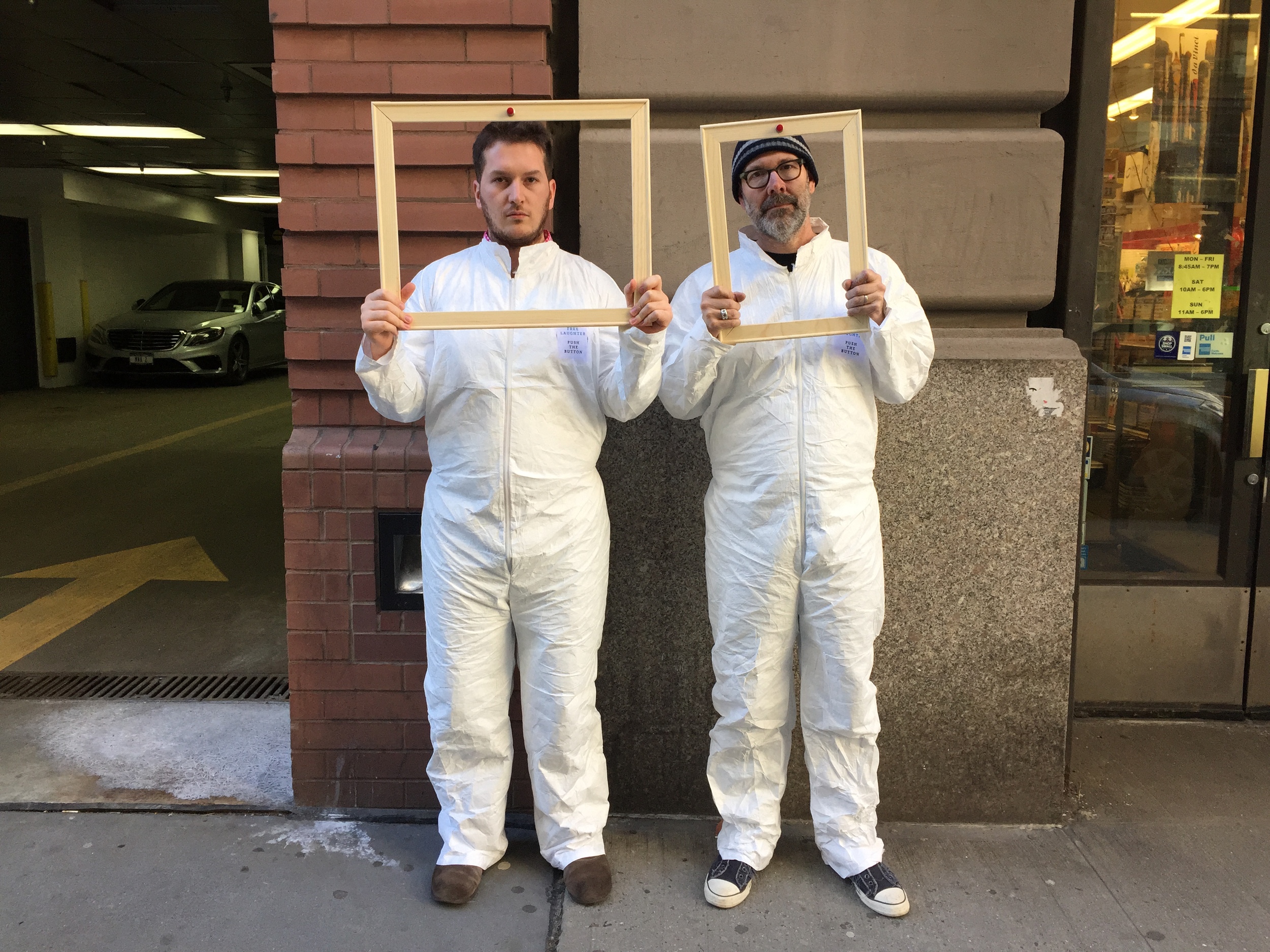
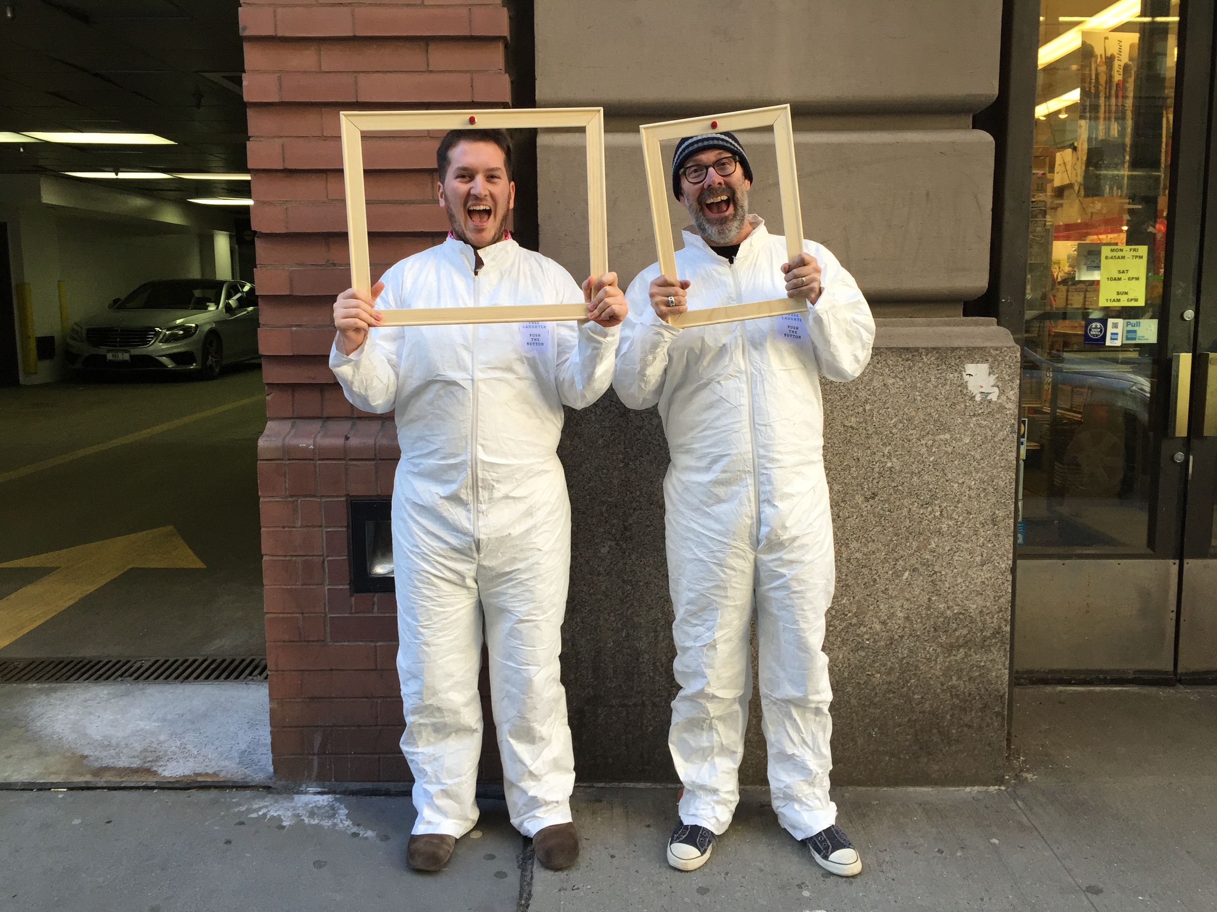
Giggle Up is a design performance and interactive experience to investigate the idea of spreading the contagious laughter. The happening took place on March 28th, 2015 in the Flatiron District. Three actors, including me, dressed in white Tyvek costumes carried wooden frames that have on/off toggle switches and LED indicators on them. The experience is designed to have three main parts:
1- Attraction: The conspicuously big toggle switches and actors who were dressed funny attracted people. Many people stopped and watched the show curiously.
2- Engagement: When the audience got engaged with the actors to turn on the switches, actors started to laugh loud, which also caused the audience to laugh.
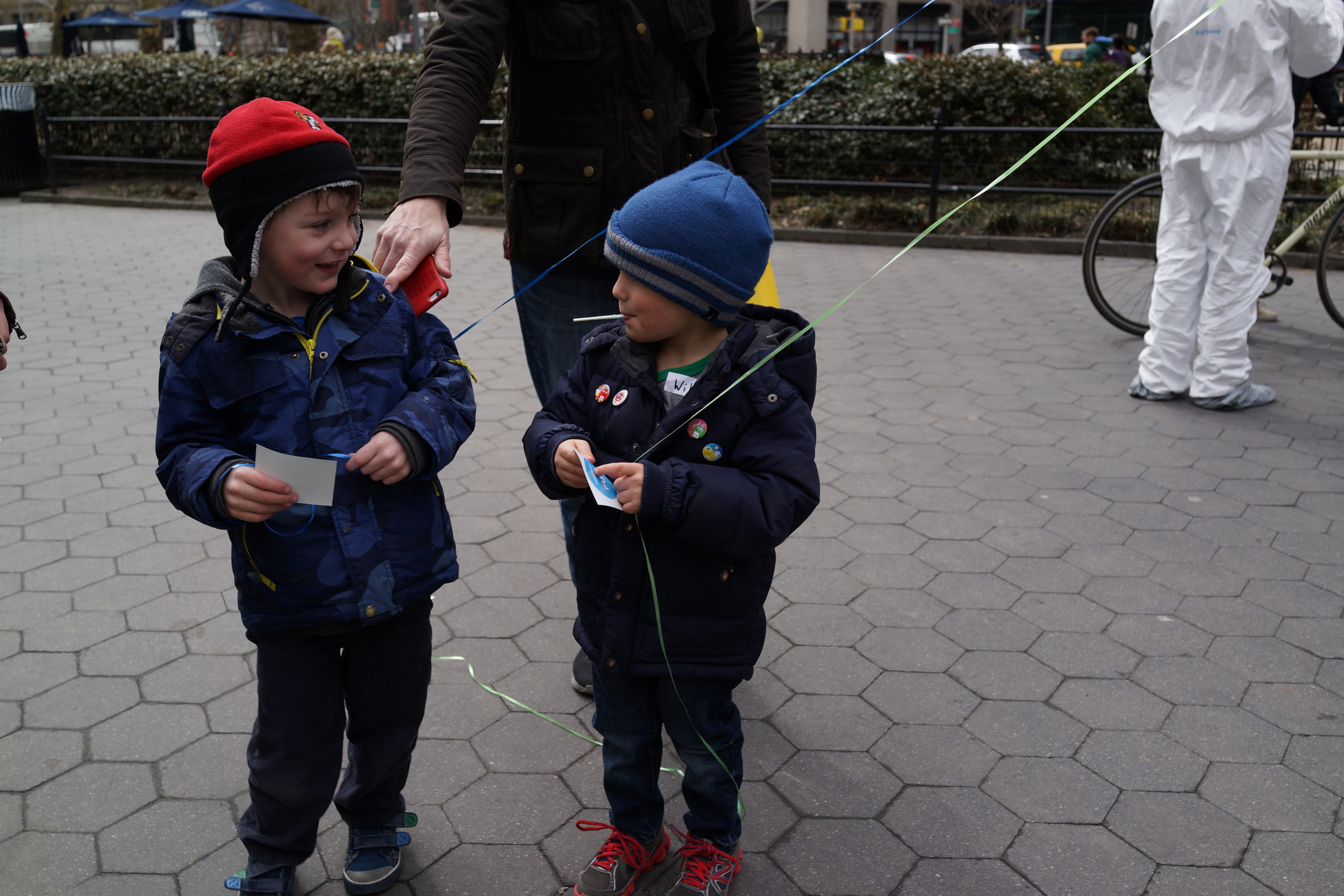
3- Takeaway: In the end, people who engaged with the happening were given stickers to put on their body, which allowed them to have a "giggle up" button, too. Then they started to play the game with each other by pushing each others' button and laughing.
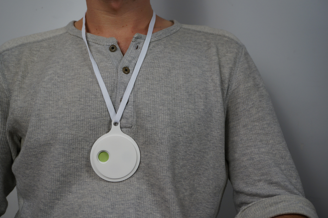
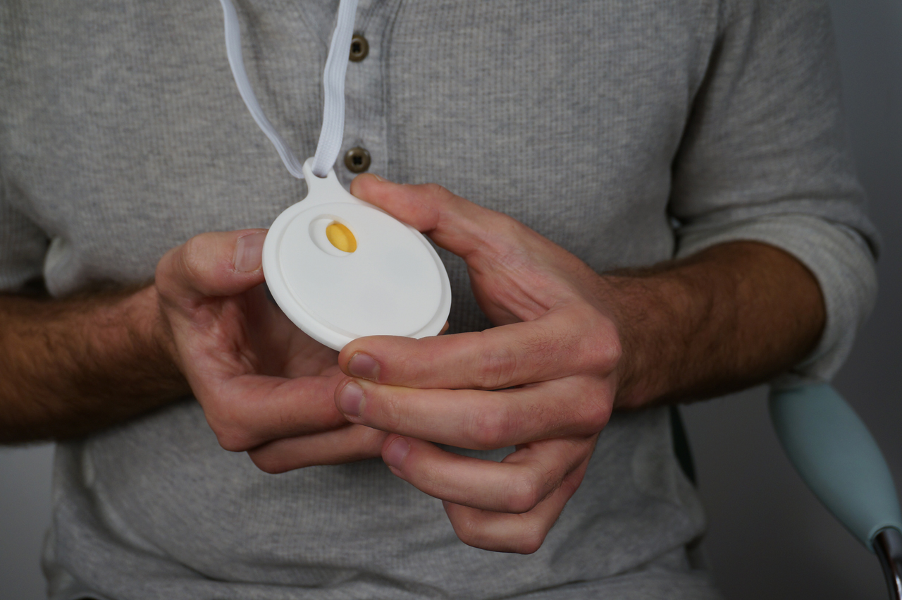
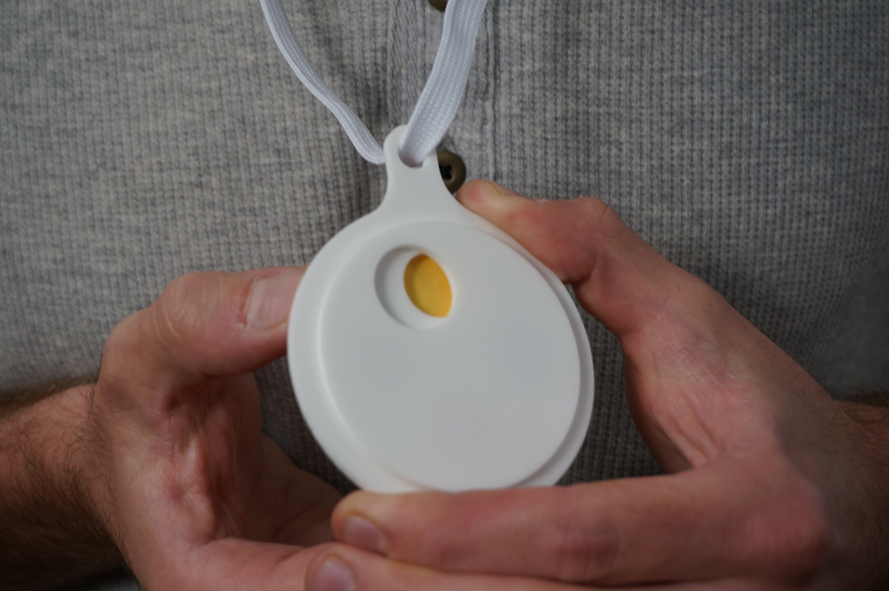
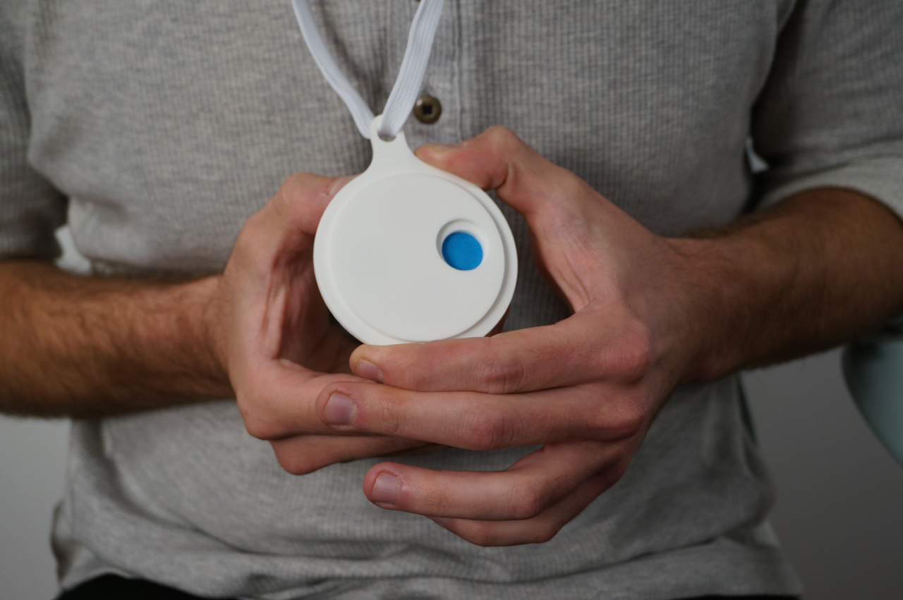
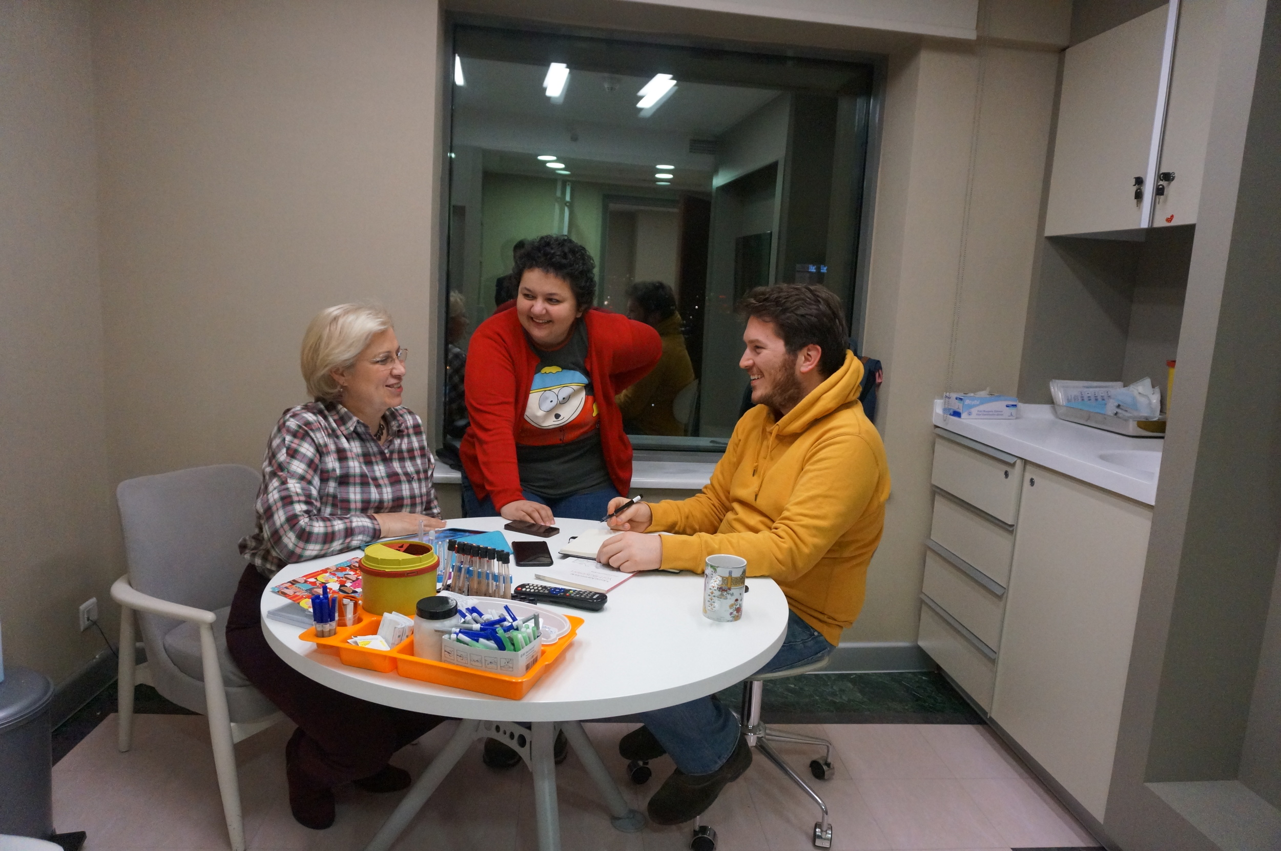
Emotion necklace helps patients, doctors and hospital staff to visually express how they feel in order to understand each other and have a better communication. Using a color code system provides a quiet design language without embarrassing the users. Each color translates to a certain feeling such as anxious, angry, grateful, tired, confused. The concept emphasizes the importance of empathy in the context of healthcare.

Laughter Box allows and encourages people to take short breaks from their daily routine and enjoy funny videos by laughing and giggling. Depending on user's taste, Laughter box delivers different type of humor content (i.e funny babies, funny accidents, funny cats, etc.) thanks to the accompanying youtube channel which users can access the videos by using their own smartphones.
I used to think that fidelity and resolution are the same concepts until very recently. However, there is a huge difference between them and it is essential to understand that difference so that you can communicate your ideas effectively.
Fidelity is about the level of details solved and how realistic the concept is, whereas resolution is about the look and how realistic the concept is visualized. On the other hand, a low fidelity / high resolution work might work better than a high fidelity / low resolution in some cases, or vice versa. However, it is important to understand the different roles these 4 quadrants to be able to communicate, test and present ideas effectively.

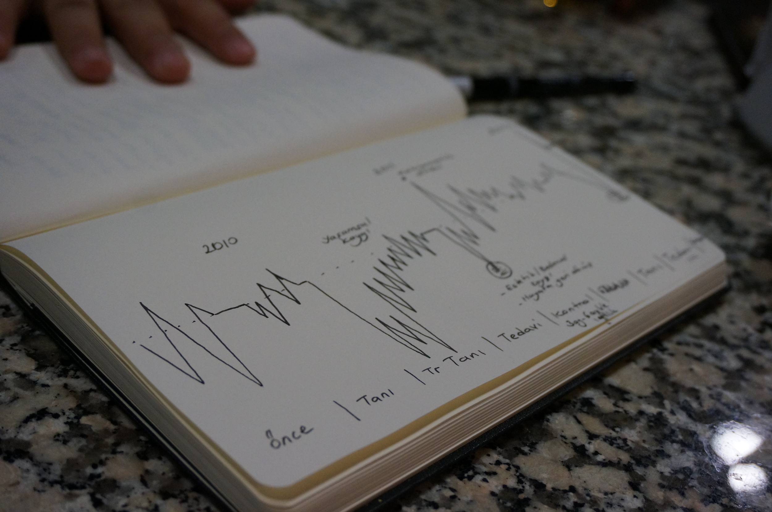
In previous weeks I made a continuum diagram to show my intentions with the direction of the thesis. My directions were: from "fixing" to "starting a conversation" from "assumption based" to "proven"; from "general healthcare" to "focused on life threatening diseases". Articulating the directions helped me to think strategically in order to take decisions about what to make for the following steps of the thesis.
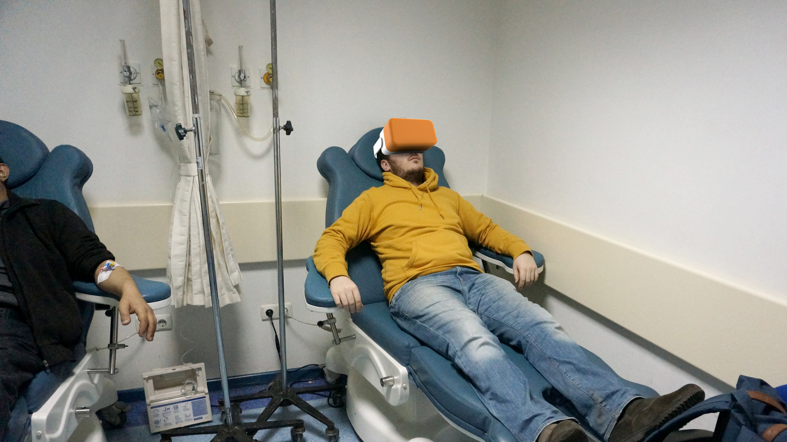
After the continuum diagramming, I was challenged to represent my goals with making "something." Since I have been thinking about the chemotherapy experience and how to change it in a positive way, I wanted to visualize one my ideas, which would also give a sense about where I want to direct my journey.
Having observed oncology clinics and interviewed with patients who were receiving chemotherapy, I realized that there are some factors that causes stress and sadness. These factors are:
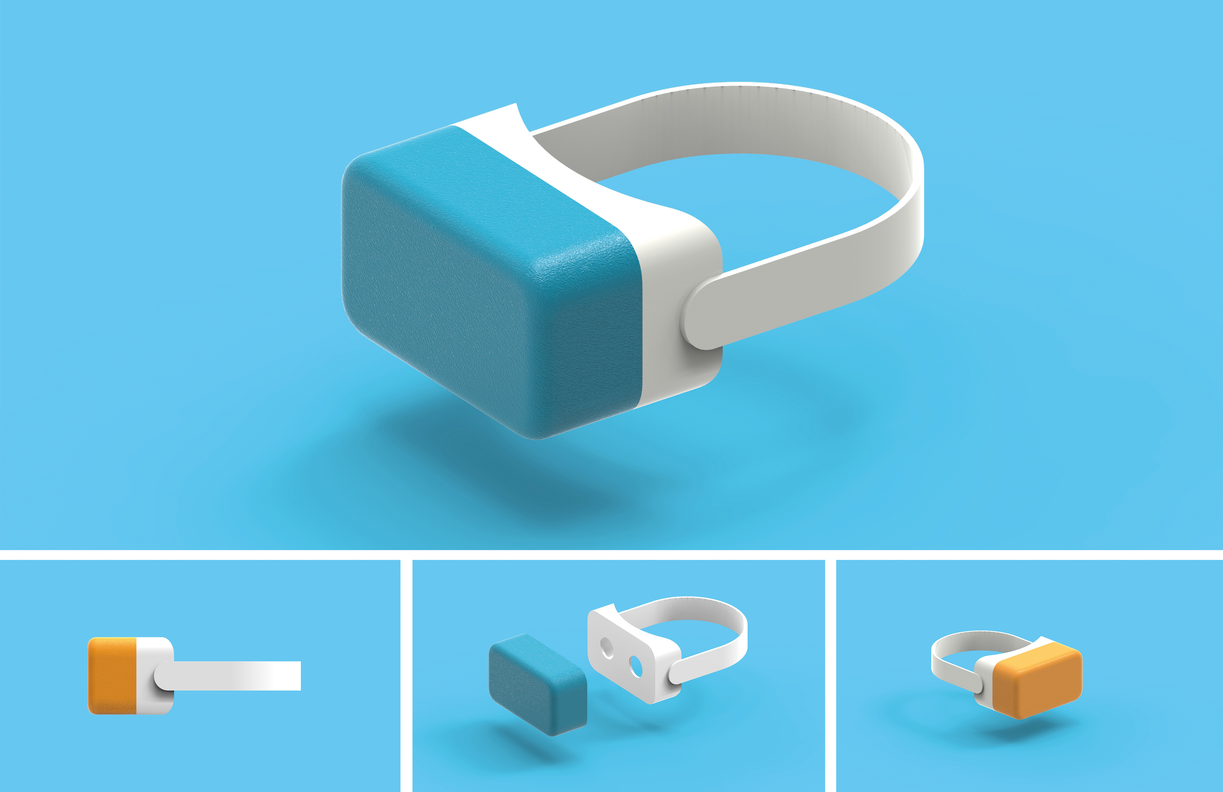
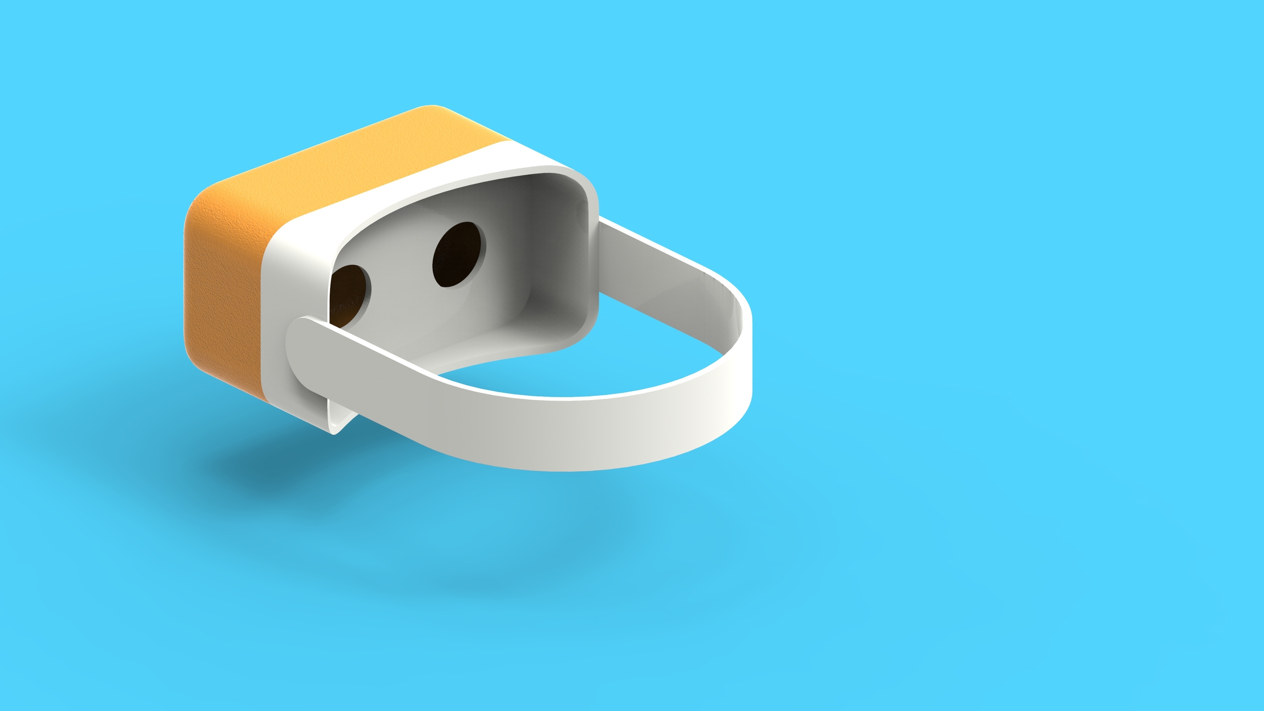
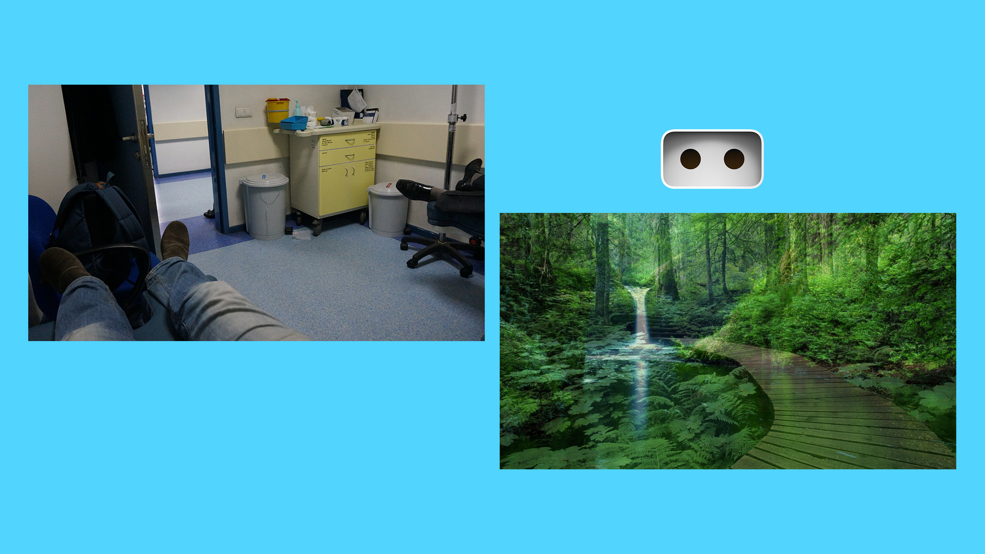
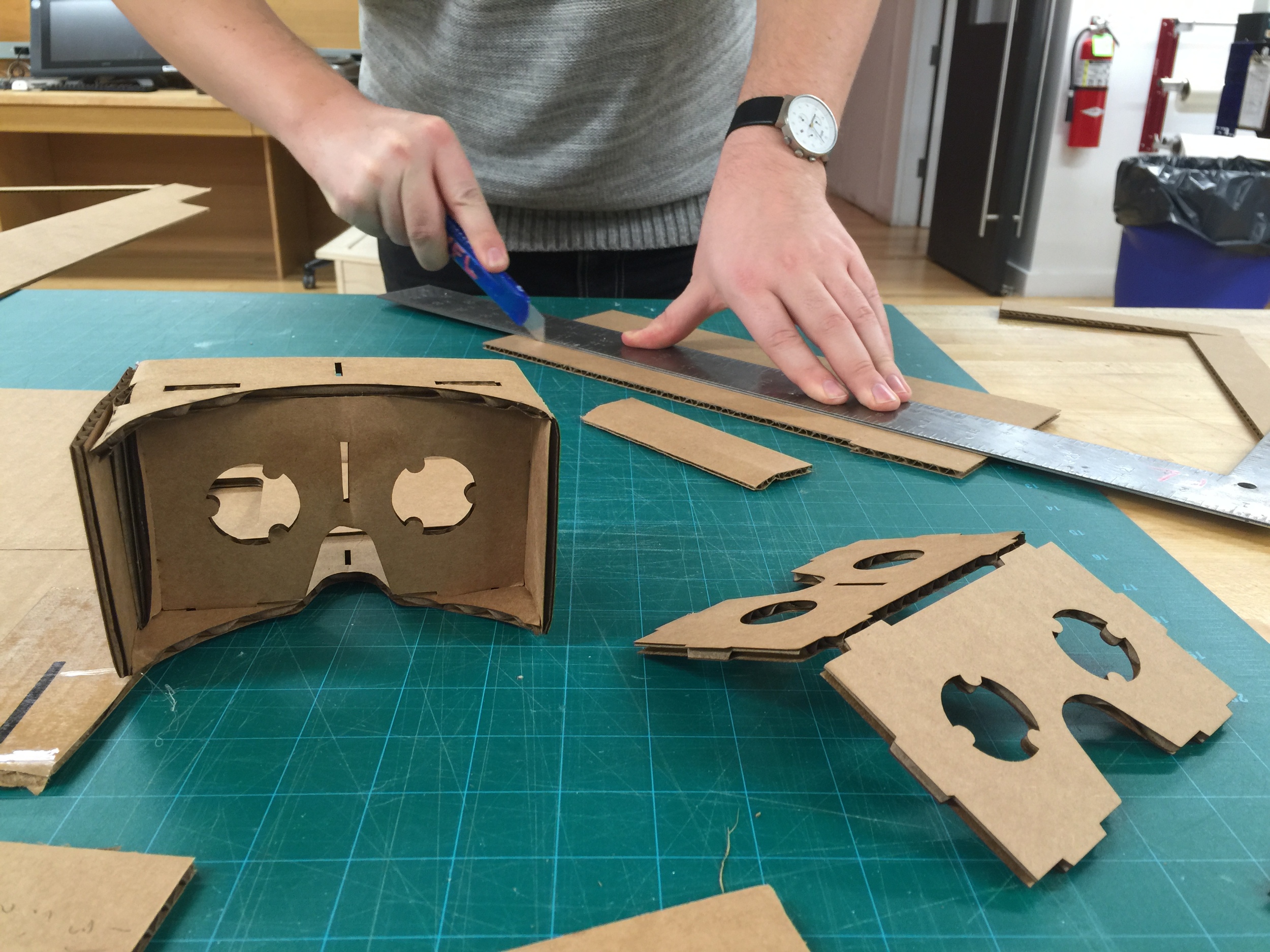
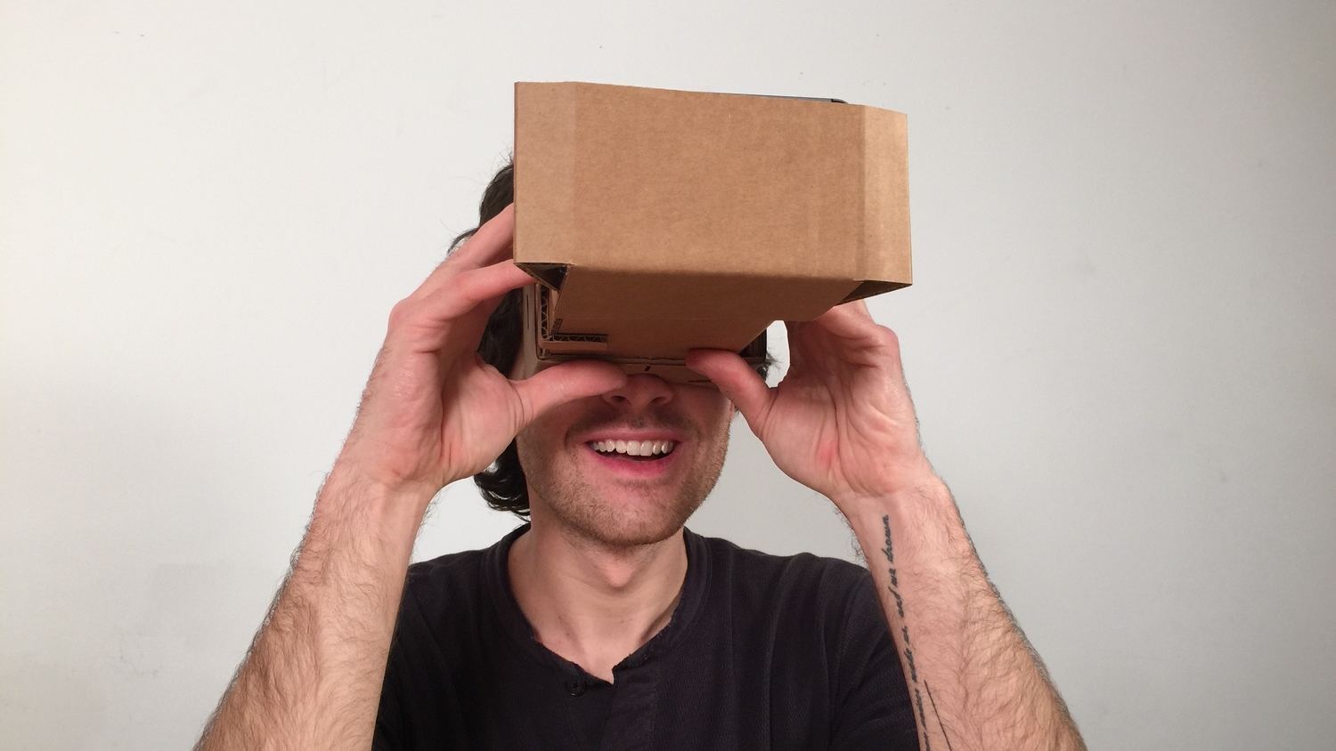
Learning from the observations I wanted to create a headset that provides relaxing nature views during the chemo. Using this headset would help patients to leave their existing thoughts related to their fears.

Figure B
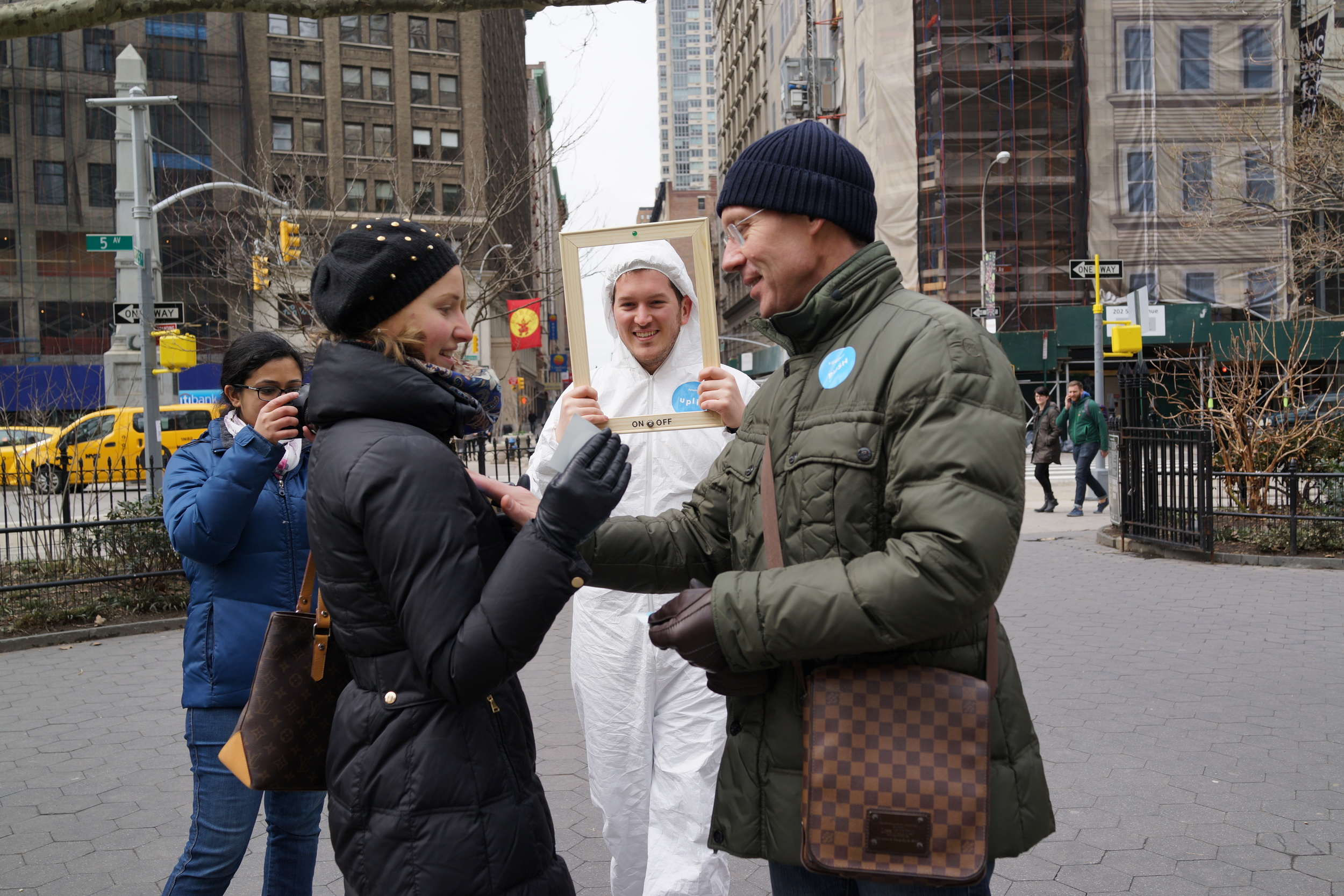
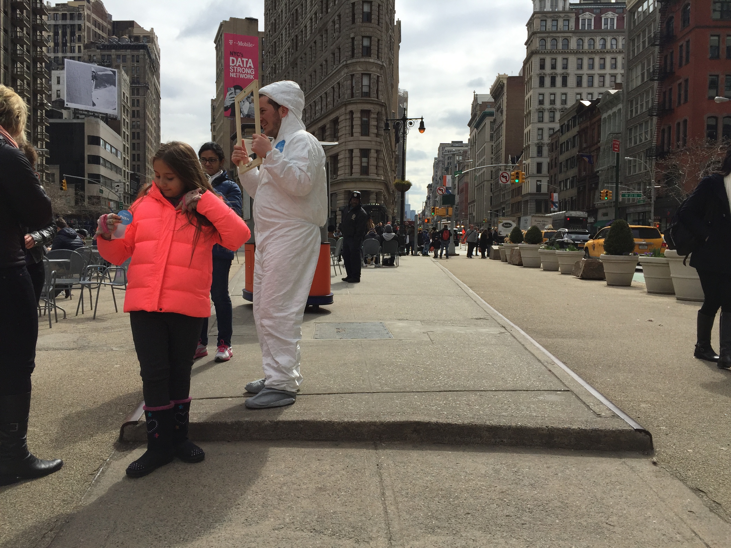
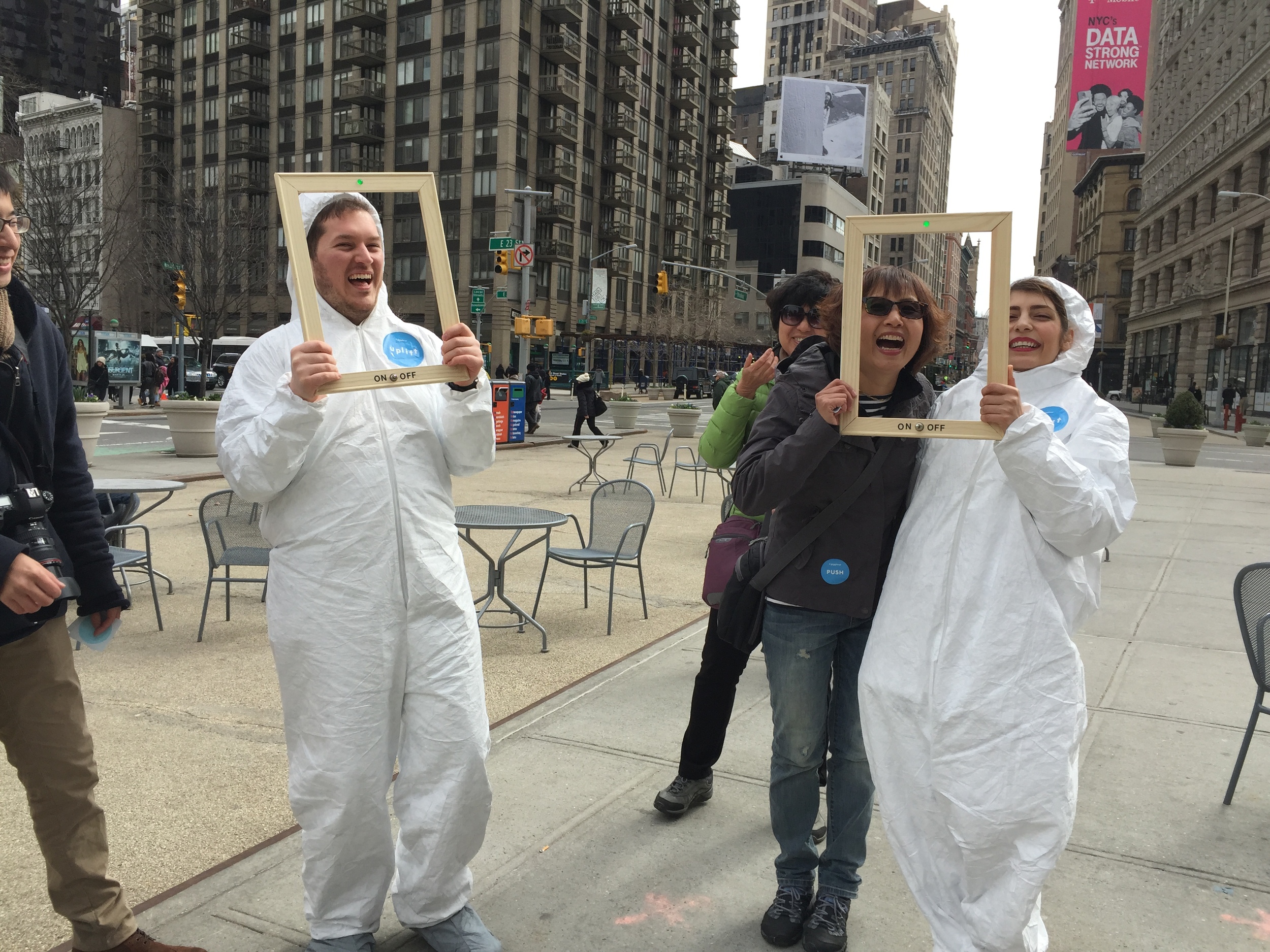
As a part of the Design Delight journey with Emilie Baltz, I tested my experience idea in order to see people's reaction and feedback outside in public. The purpose of this experience is to create an interactive game that provokes laughter. The frames that I and my classmate Steve Hamilton are using have switches to attract people to the interaction. The goal of the props, in this case, frames are to create a focus on the faces so that we can look at each other and pass on the laughter. Some take away from the test are that the positioning of buttons has a huge role in the interaction, doing it as two people is better than doing alone and having a naturally smiley face is better than a neutral face.
Next steps are prototyping again and testing it out with people outside. Knowing that Friday March 20th is the international Happiness Day I am very excited to take this experience to the Central Park next weekend.


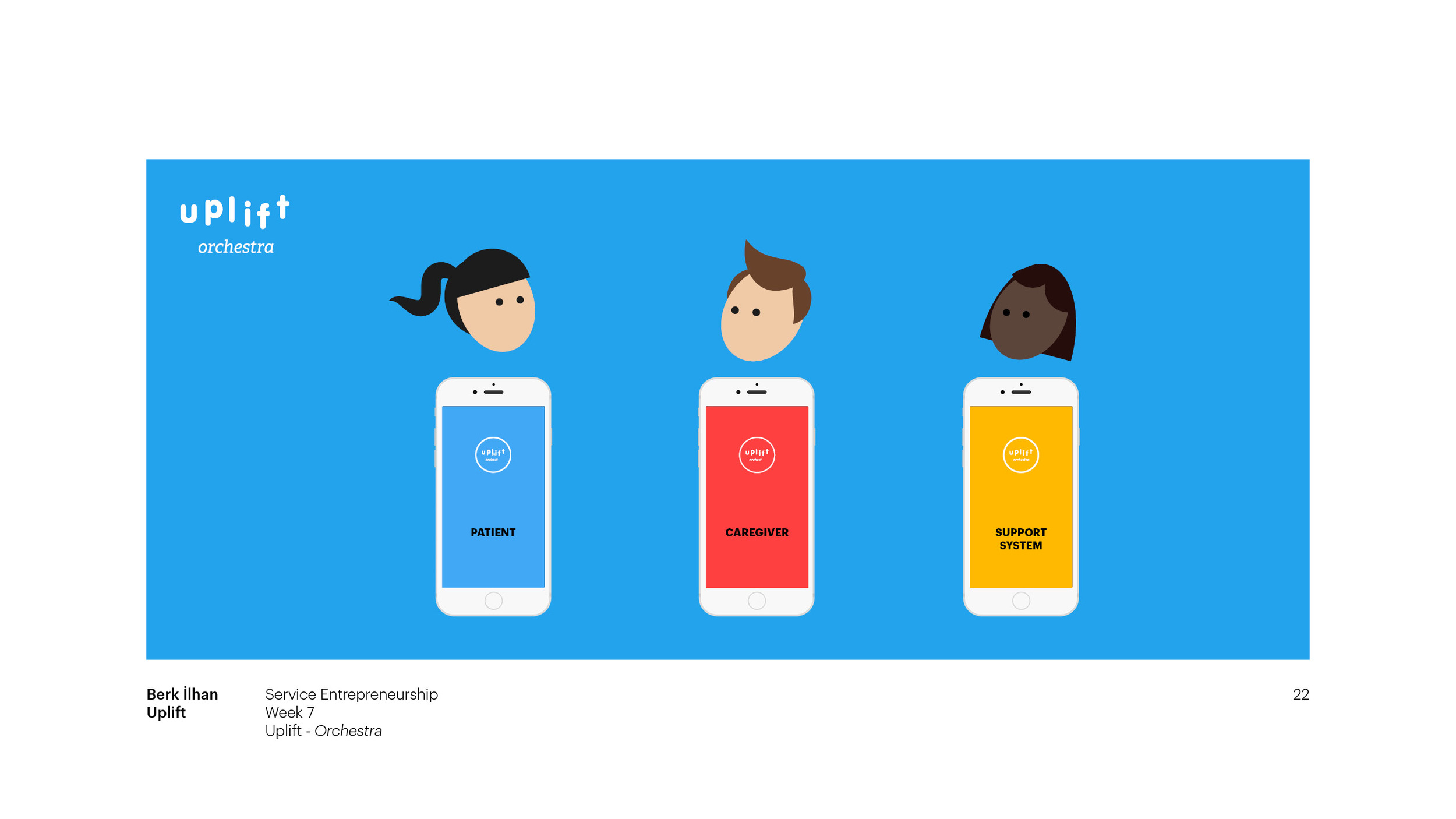
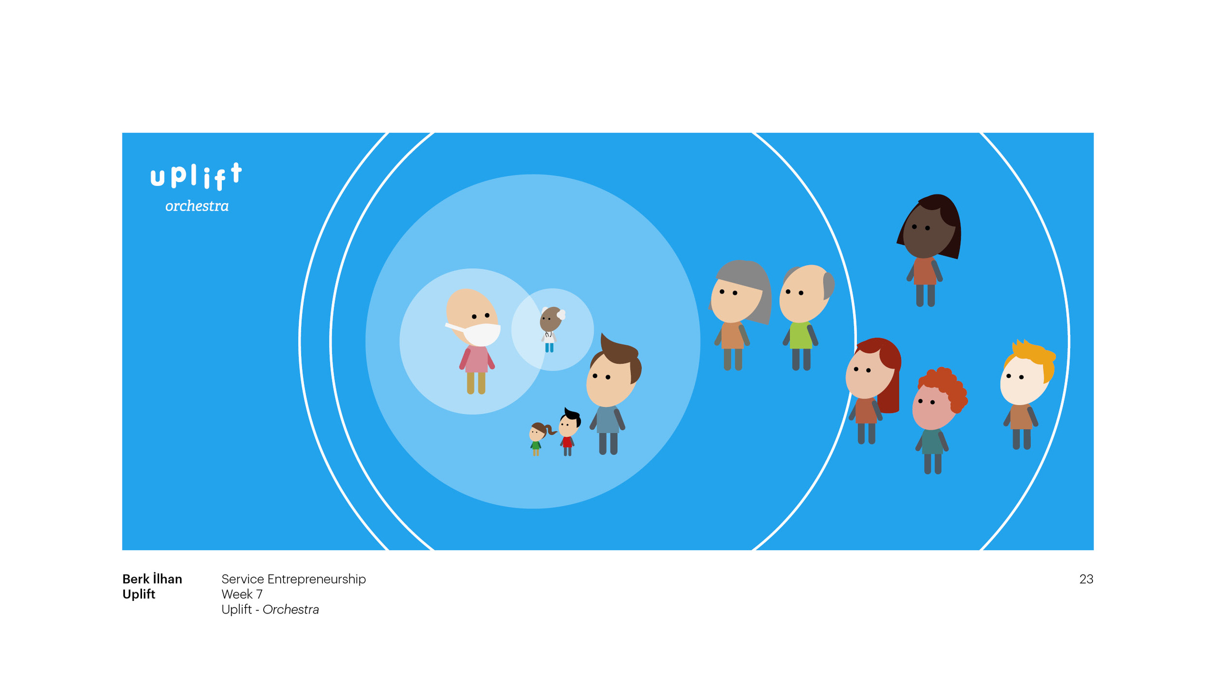
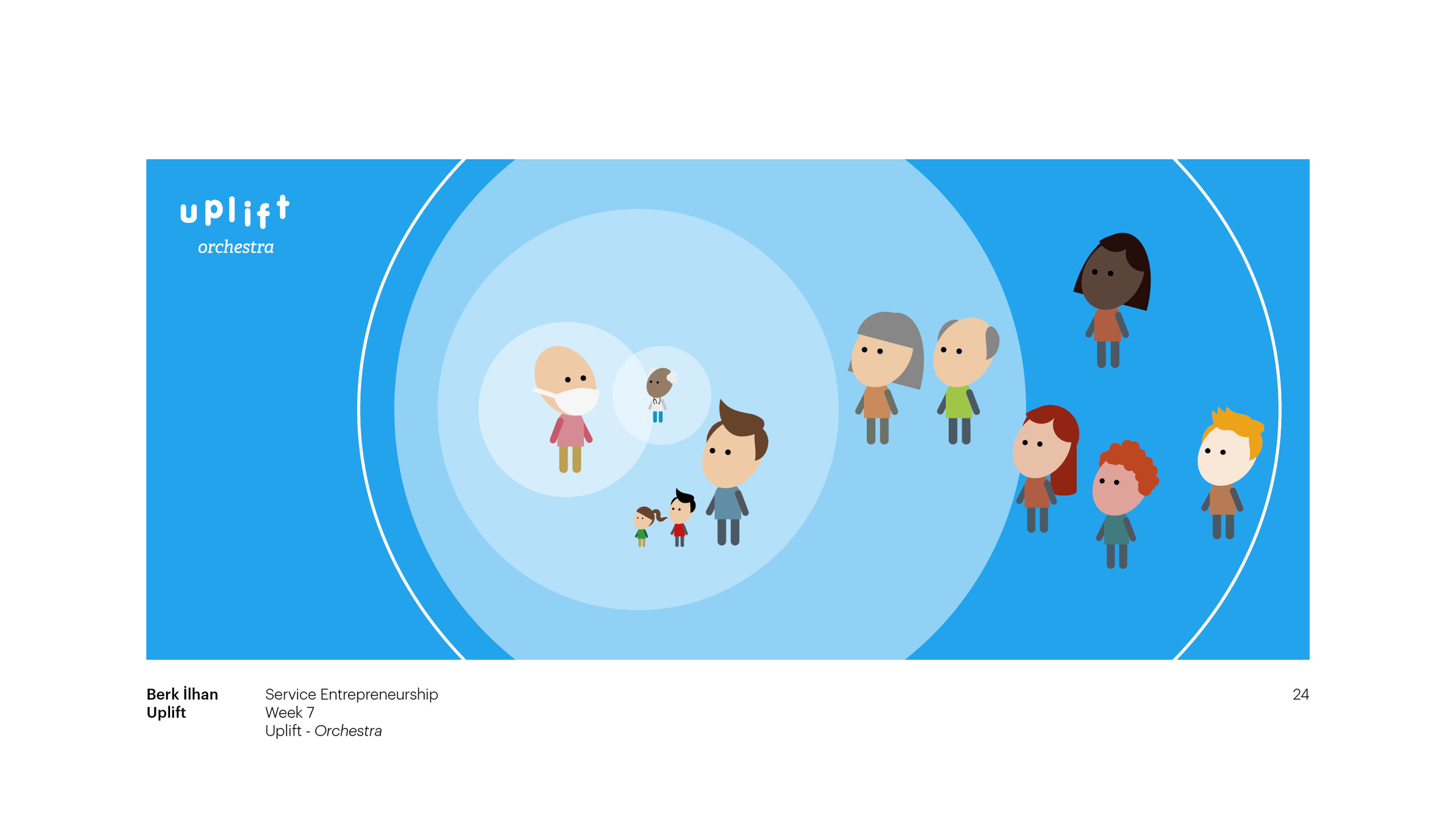
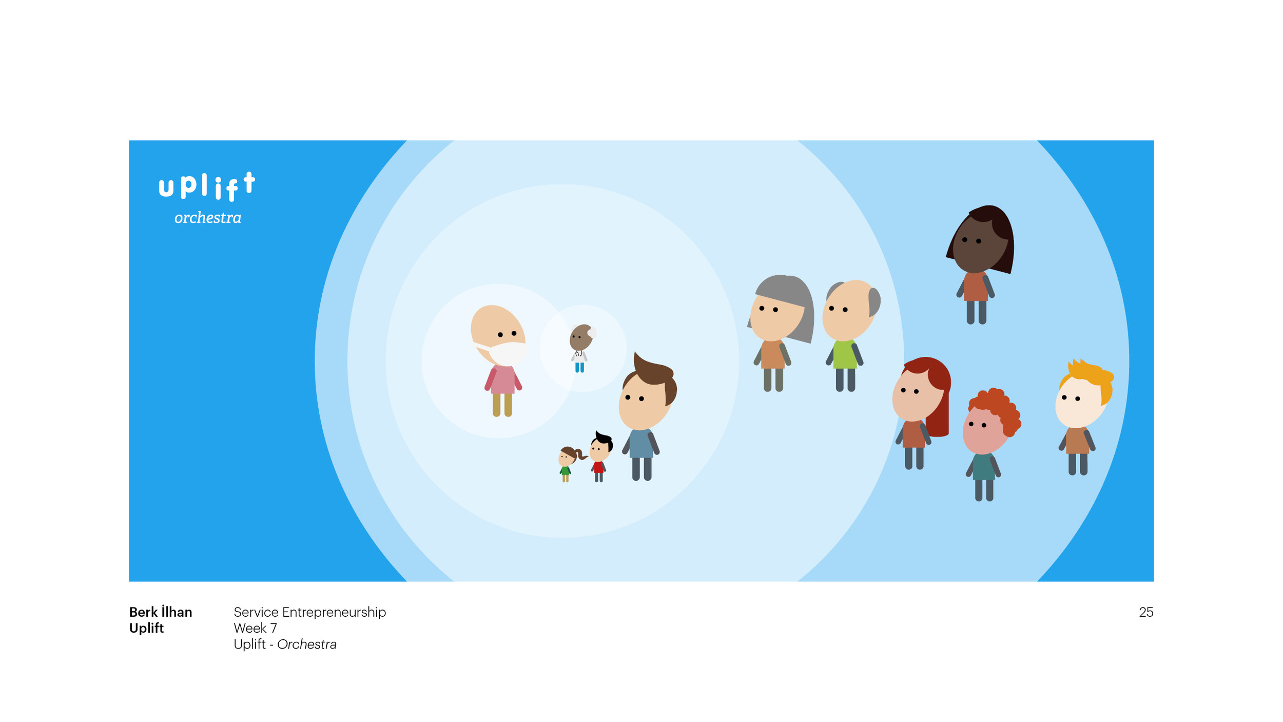
Learning a variety of diagramming methods and system modelling tools both from Steven Dean and Abby Covert I have created a lot of maps and diagrams to explain the complicated relationships between the stakeholders and situations of the project Uplift, over the last two months.
Last week, in Abby Covert's workshop I showed my first mapping sketch, Map v.1. After having a discussion with the group and criticizing my own mapping by using the guidance provided by Abby, I iterated the map and created Map v.2. Some of the criteria that I took into consideration while re-designing my map were the direction of the flow, the clarity of the purpose, color coding and the relationship between things.
Map v.2
Map v.1
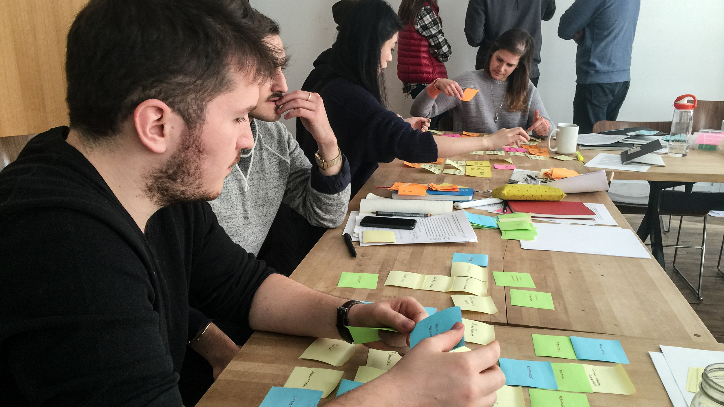
This week, in thesis workshop, I collaborated with two classmates to analyze and understand the needs of our theses' audience, the context, where these needs are observed within certain boundaries, channels that could enable us to reach out the audience to meet their needs and factors that need to be considered. We worked with sticky notes to put our suggestions on each others' maps and it was very helpful to collaborate since it allows you to look at your thesis from different perspectives.
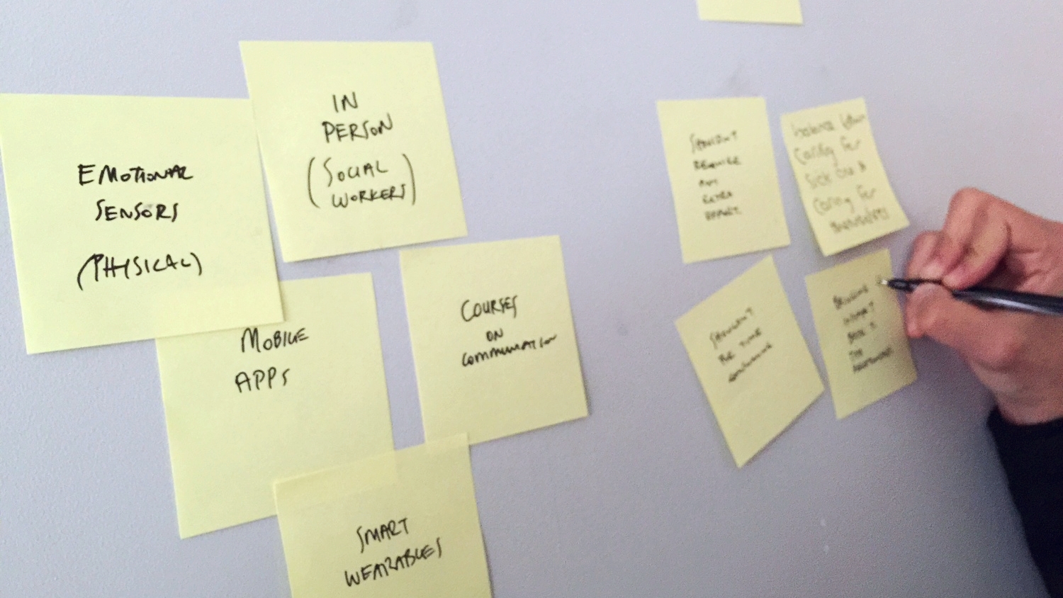
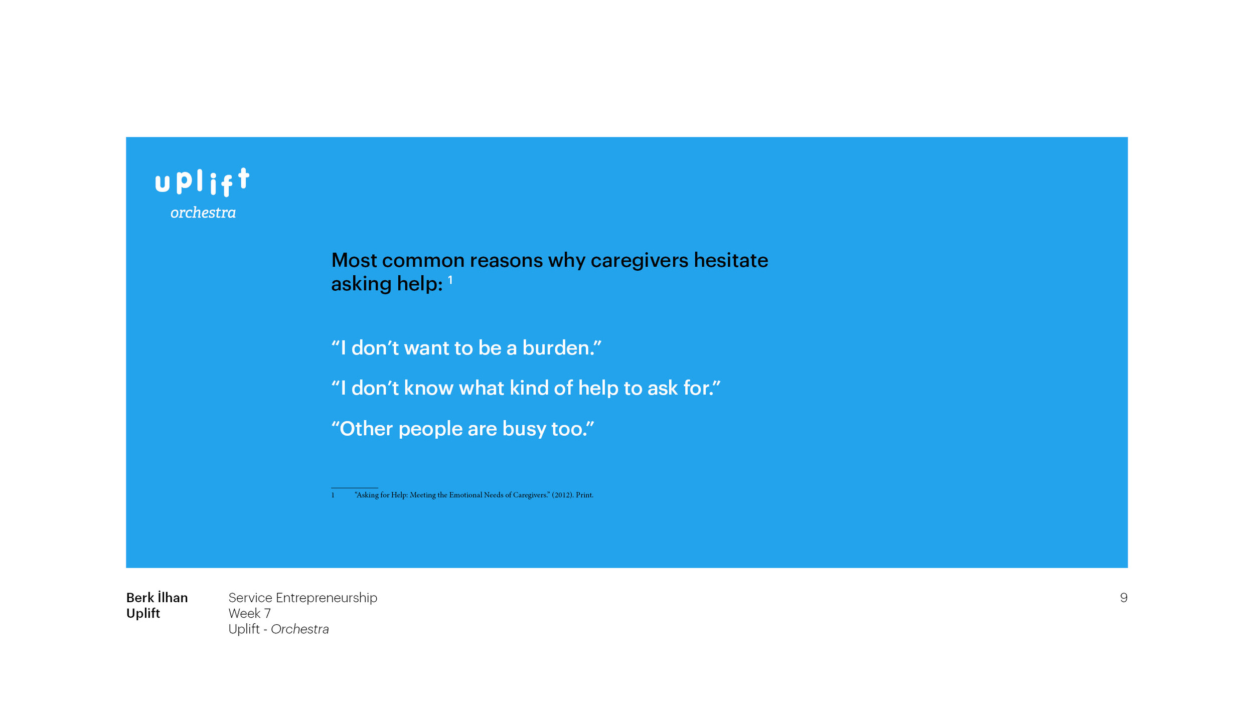
We began with choosing the persona to work with. For my topic, it was caregiver. Then, we had a conversation on the needs of caregiver. The consensus was that caregiver needs to communicate with the patient effectively so that they can be more helpful for each other. We looked at these needs in the context of hospital care and home care, by considering the caregiver as a close relative of patient or the significant other. The channels to improve communication skills of caregiver could be reaching them in person with social workers, providing them with mobile apps, courses, smart wearables that embody emotional sensors. Some factors we took into consideration were that a caregiver is usually exhausted and couldn't manage any experience with high friction. In other words, the experience should not require complicated processes to learn how to interact with it. It should be affordable, because cancer patients and their families already spend lots of money during this process. It should not be time consuming, because caregivers and patients are usually very busy with hospital visits and treatment processes.
Overall, this exercise was very insightful to analyse a topic carefully, through different lenses.
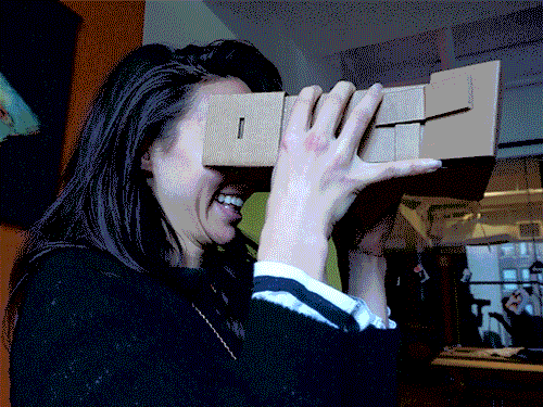
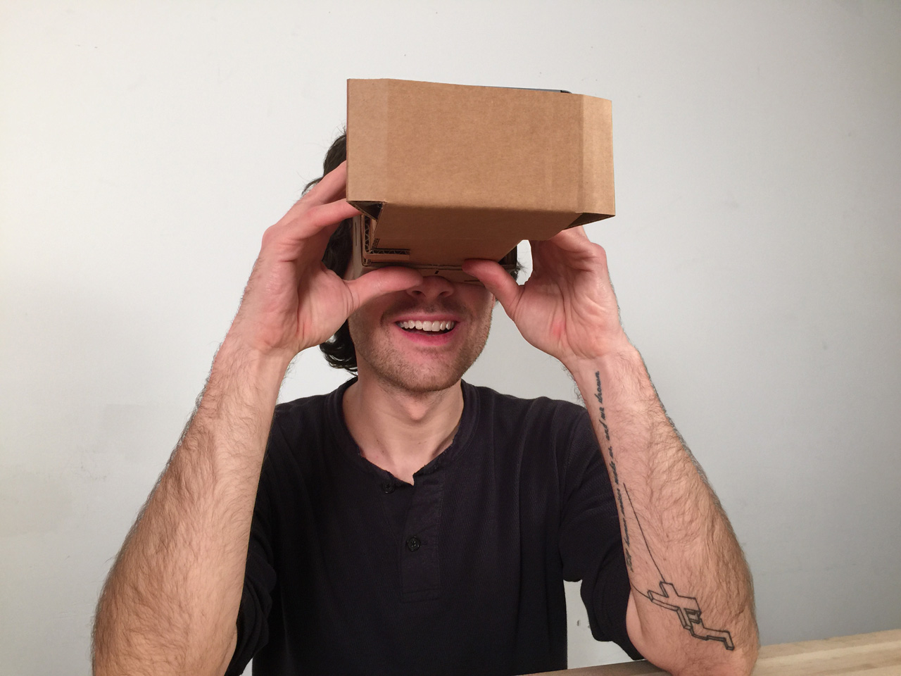
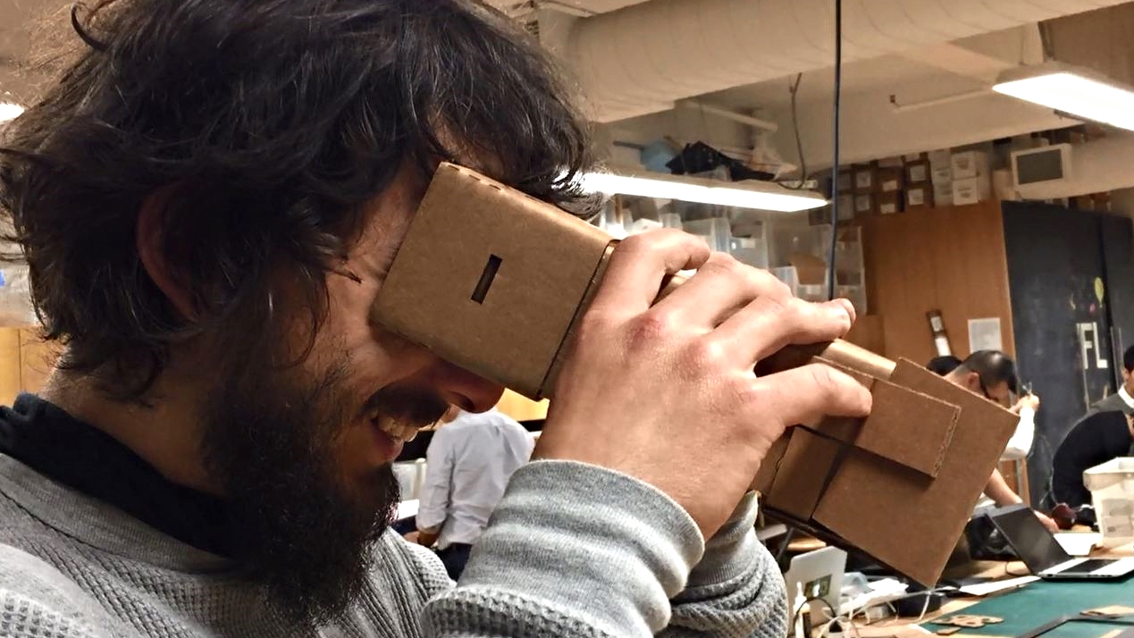
After imagining a device that would provoke its users to laugh, I decided to prototype this idea very quickly in order to try it with real people. With the original rendering that I made (the first image) my aim was to dream a collaboration between Philips Healthcare, Jimmy Kimmel and Memorial Sloan Kettering Cancer Center. The purpose of this collaboration is to provide patients with a magical headset that makes them laugh as they use. Emphasizing the important health benefits of laughter , the idea is to bring laughter as a therapy to the cancer patients, most of who suffer from depression due to cancer related experiences.
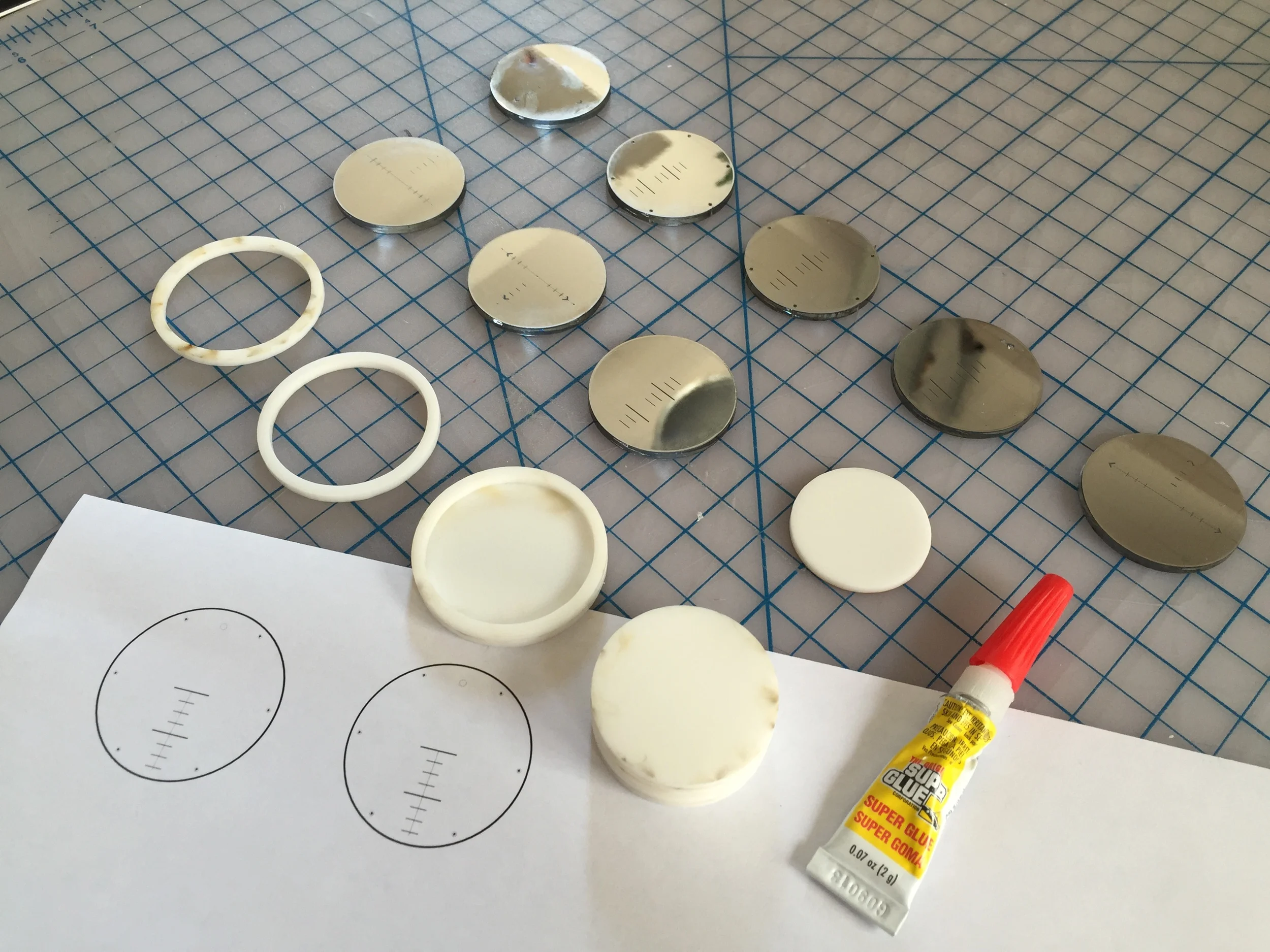
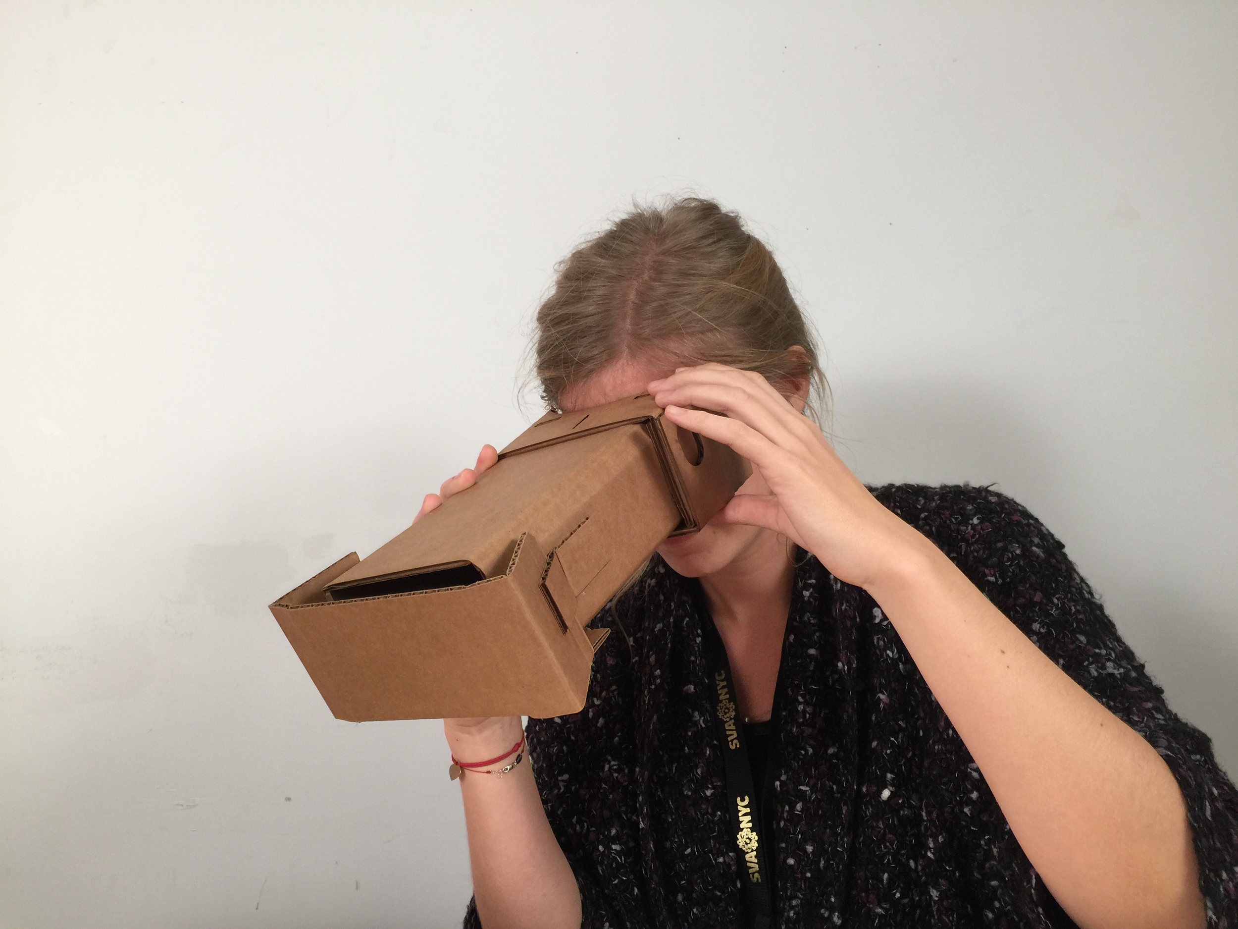
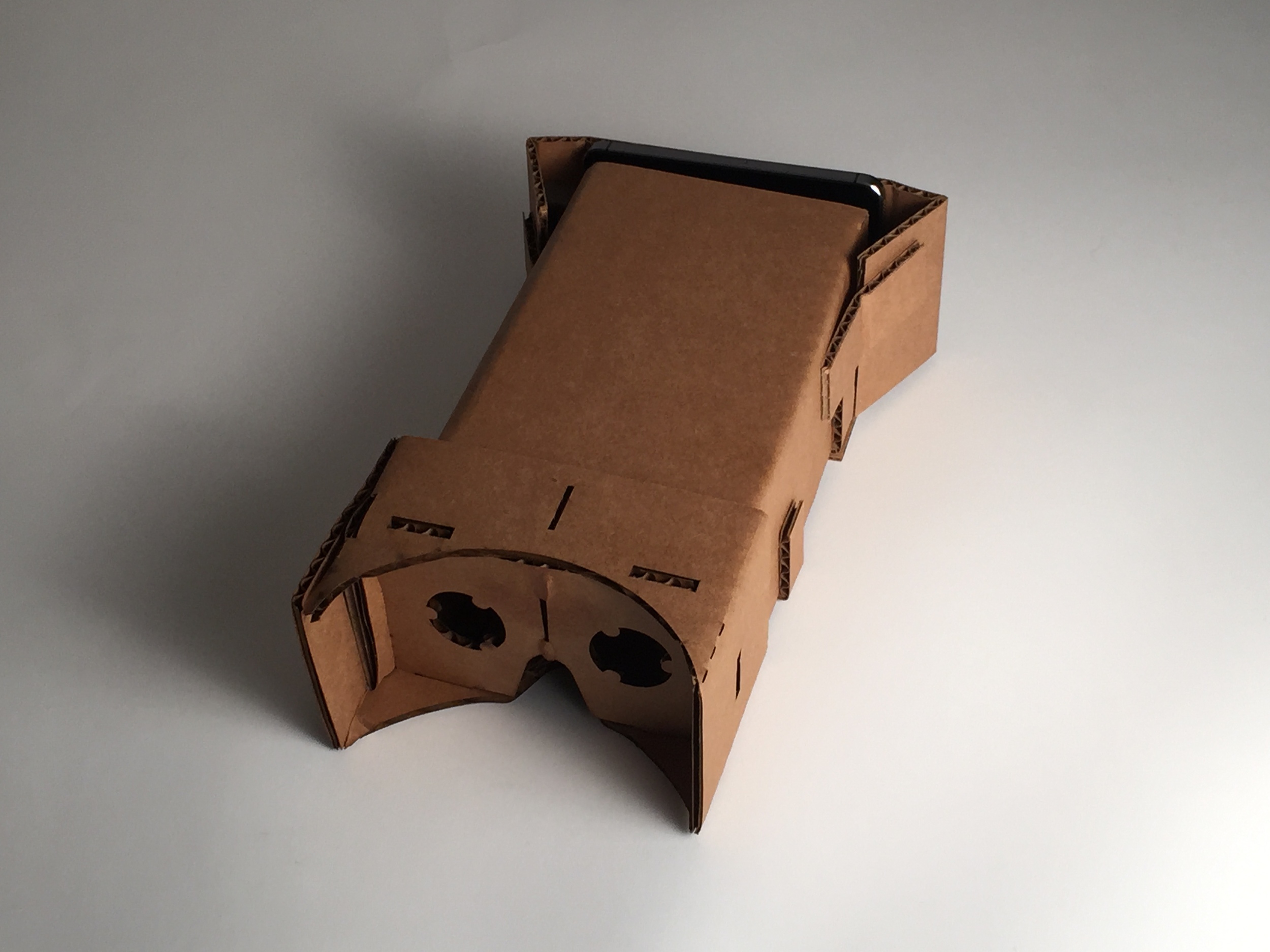
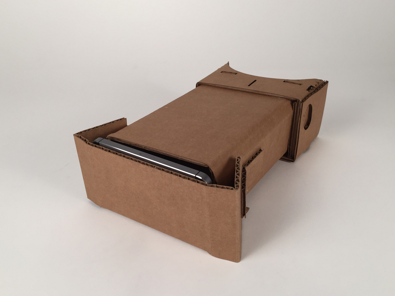
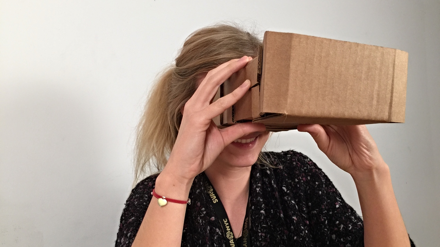
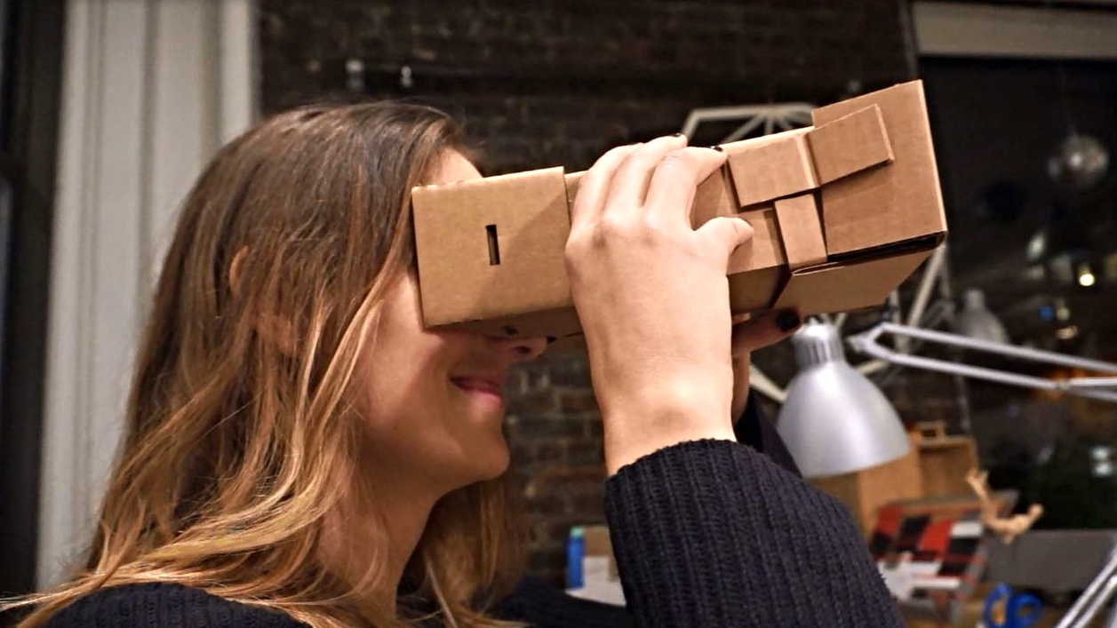
In order to test the concept, I downloaded Google Cardboard layout from Google, then I manipulated the size and the shape to create a different experience. Afterwards, I chose several entertaining and funny videos such as cats and laughing baby videos. Then, I opened these videos on my phone and placed my phone into the cardboard prototype.
I tested the prototype with approximately 10 people from different ages ranging between 24-32. Similar initial reactions were; excitement to engage with the product, dropping the chins, disassociating self from the physical environment, engaging with the stimuli at a high level. Some of them expressed their feeling as "being in a movie theater", "forgetting where actually I am."
These observations showed that the laughter device would actually make people laugh. Therefore, hypothetically doctors could prescribe "laughter" to their patients.
Next step is to test it with patients in clinics. This week I am meeting with a physical therapist in order to explain the idea and kick off the patient test.


In this week’s thesis workshop we focused on articulating intentions in order to decide what actions, directions, methods or outputs would be good or bad. One of the helpful and clarifying examples that Abby (Covert) gave was “casino carpets”. Showing the images of carpets, which have tons of contrasting colors and tiny patterns with lots of details, Abby asked us if they are good or bad. After we had a quick discussion as a class she asked the purpose of the carpet and discussion moved forward. Then the realization was that those carpets are actually “good” when considered the intentions of a casino. The main idea is that it is not logical to judge something without considering its context and the intentions behind that decision.
Then we teamed up with two of our classmates to articulate our intentions about our theses. While one of the team members was talking about his/her thesis, other team members wrote downs the words by picking up from his/her sentences. Finally we sorted out those words to see which are good and which are bad. Some of the good words popped out in my turn were “solving real problems”, “producing meaningful products”, “speculative”, “viable”, “interesting” and “inspiring” and some of the bad ones that came from my fears and the directions that I avoid were “fostering capitalism”, “unclear target”, “inadequate research”. Moving forward to the next steps, it was very helpful to learn about these strategic thinking tools in order to judge my potential decisions in my thesis.


Approaching thesis through the lens of branding helped me to understand the essence of it and what kind of purpose, positioning and promise that Uplift offer to the audience. I built the brand pyramid and decided on the hierarchy of the visual, sentimental, logical and spiritual aspects of the objects that I designed within this frame-work. Deciding on the appropriate color palette and materials leaded a better visual representation which matches the core senses of the brand.


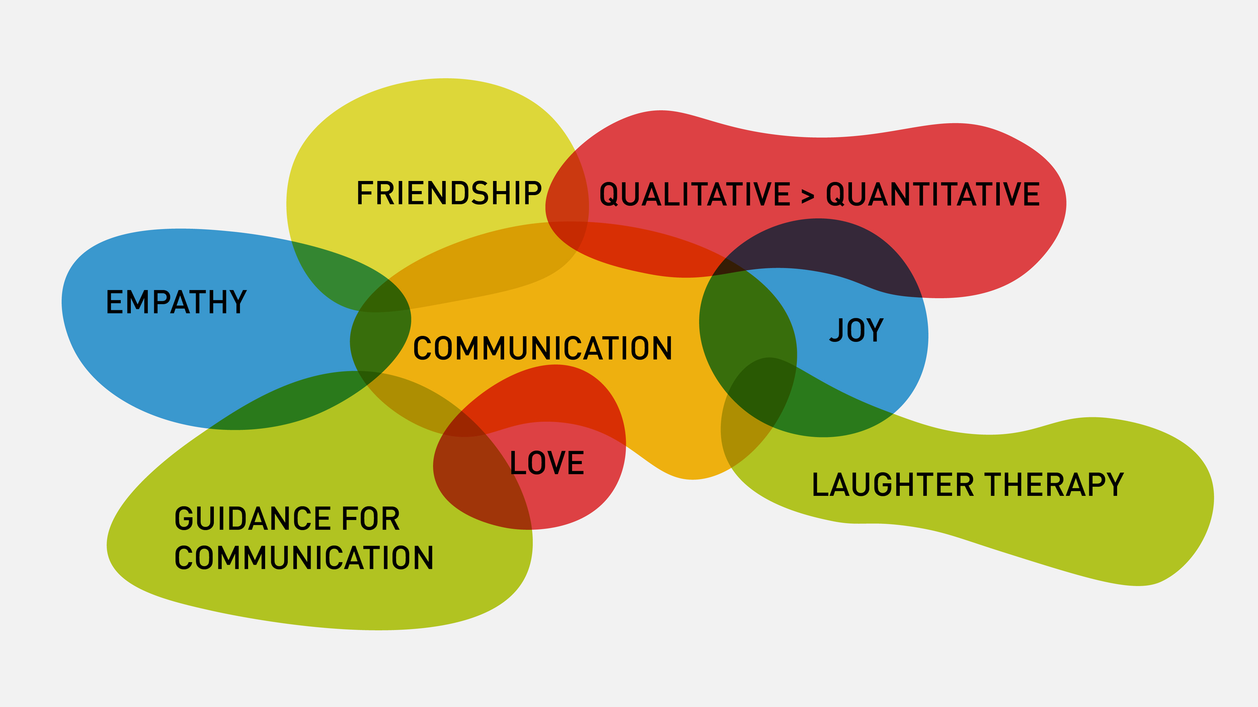
For today’s thesis workshop we were asked to create a visual aid in order to simplify a complex territory in our theses. Using Abby Covert’s “How to Make Sense of Any Mess” book as a guide, the first thing I followed was “draw the mess” exercise. Abby, in her book, suggests to draw the mess in order to understand it. Here in this drawing (Figure A), I realized that I am trying to make some points about love, communication, empathy, joy and many other things which overall is productizing complementary medicine.

Then, for the visual aid I drew this mess on a big medium (Figure B) and then I drew another mapping diagram to show my main purpose with this mess. Which is basically to say “ideal health is in the transaction of complementary and conventional medicine”. In class workshop, we paired up with classmates in a speed dating format to show our information architecture trials to each other. Showing the mess out of your head and on the paper to someone else helps you a lot in realizing how difficult it is to understand an unfamiliar topic, because seeing his reaction makes you empathize with him and look at your graphics from his perspective. Some points that I found out are colors are incredibly important and dangerous. One should be aware of how much it could be confusing to use different colors on a mapping diagram. If there is no color coding or rational reasons, then the audience get confuse, because they try to associate the elements with similar colors.

Another thing that I realized is that the language should be crafted in a way that your audience could easily digest the information on your materials. In this case my audience was not oncologists, cancer survivors or medical designers, but it was my classmates, the majority of who are unfamiliar with the lexicon (jargon) of the topic.
Other than this exercise there was another workshop which helped me to see the priorities of different people in my thesis. We each wrote down the direct users of our thesis products/services, the people who might be helpful for our careers, the industry people whom our work touches to and the people whom we want to make proud. Although I have been unconsciously thinking about all these people in somewhere deep in my brain, it was amazingly helpful to name them and see how I prioritize them on an axis, visually (Figure D). Throughout this workshop we were in teams and we helped each other to solve some prioritization or naming issues. It is obvious that getting a couple of fresh eyes into your complexity helps a lot.

Today we were given a lecture about architecting information by Abby Covert, who is an information architecture, the author of How to Make Sense of Any Mess and the teacher of thesis class. At first Abby told about the complexity of the things, and how difficult it is to deliver information to others. Then she explained the difference between data, content and information. Listening the meanings of these words from her was just mind blowing. I never thought that carefully about these terms and I wouldn't differentiate them in this way. Learning about information architecture and making sense of any mess I re-thought about my thesis work so far, and the reactions that I received from the audience recently. Then I realized that my presentation and book were not clear enough to deliver the main ideas and points that I want to address.
In order to identify obstacles, risks, dreaded skills, excitements and fears we did an in-class exercise. With pairs we discussed our current issues with our own theses. By talking aloud we were able to identify and articulate the problems much more effectively. Also, it requires courage to reveal the weak points of the theses. However, I thought it was essential to do so, because problems became visible. According the mapping out that I did for my thesis, I understood that I am having a main problem which is about deciding on the audience that thesis is indented to talk to. Realizing the capability of my skill set was encouraging, although fears and obstacles about writing and editing were seriously obvious.
Learning from today’s exercise, I think one of the most important first steps for my thesis are deciding on what my thesis, Uplift, is about concisely; who is the audience of my thesis and who is the audience of my book. Thus, I will decide on the tone of voice for the thesis and the architecture of the information.
"Love and caring are critical tools for helping patients get better. If it were a form of medication, we would prescribe it." says Ronnie Nathan, Chief Barker of the Variety Club.
Hospital visitations are very important for in-patients. Seeing a friend or a family member helps a lot for recovery. Talk to me is a voice recorder device that enables patients to capture the joyful moments from guest visitations and re-listen them. By picking one of the colorful interactive sticks and plugging it into the base, the user starts recording a personal voice message to his/her loved one who is sick. Thereafter, the patient could tap on each stick and listen to those heart-warming messages when they are alone in the hospital room.